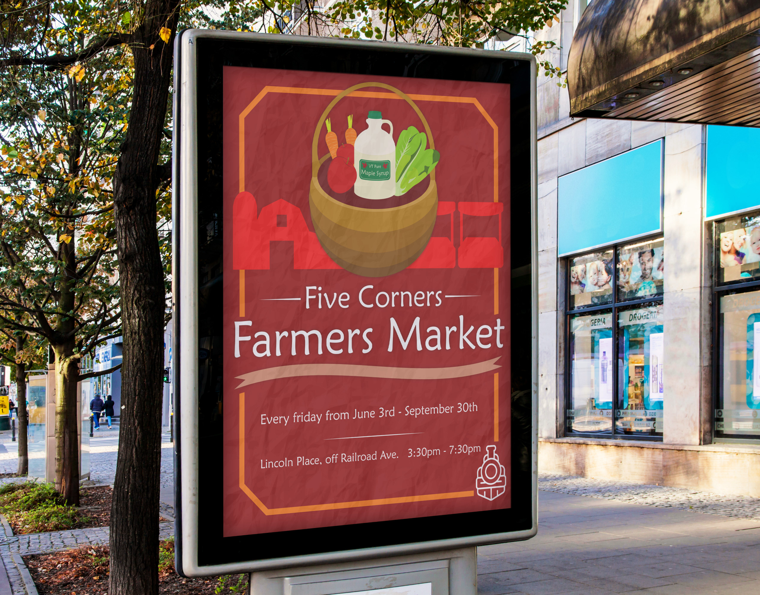
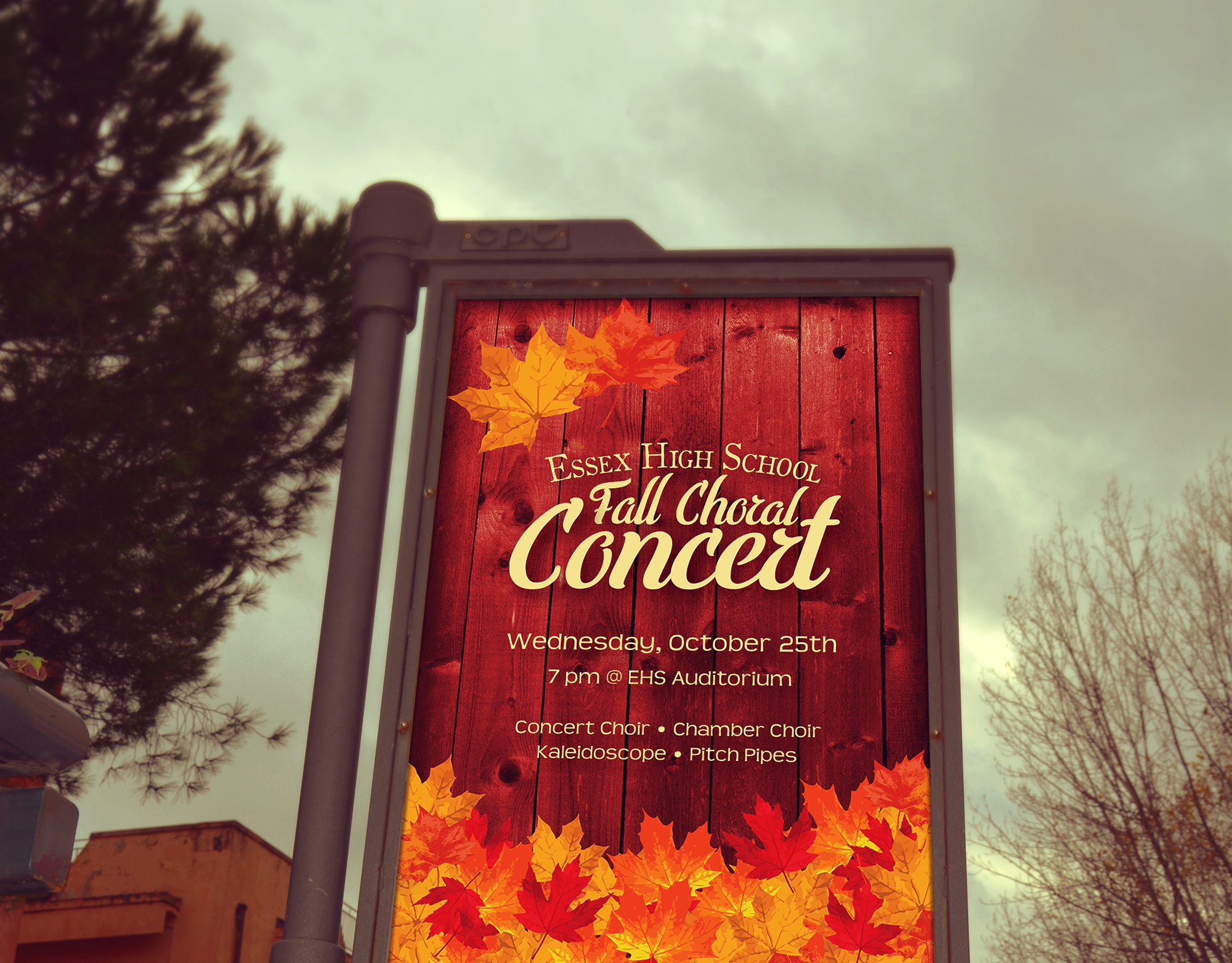
This was a practice poster design for a local community event in Vermont.
This was originally just supposed to be a poster design to help me practice and hone my design skills, focusing primarily on hierarchy and digital illustration, while limiting myself to a monochromatic color scheme and flat imagery. The annual Corn Roast is a real event held in Underhill, VT, although this design was just for practice and wasn't actually pitched to the event hosts.
I think the biggest challenge that arose from this piece was finding a way of arranging the necessary information in a way that makes the poster both hierarchically accurate and visually dynamic. I remember playing around with colors, font size, and image layout for quite a while to try and get it as perfect as possible.
The final result is engaging, energetic, cozy, and fun! All things associated with the annual Essex Alliance Corn Roast.
