Overview
This project is a theoretical rebrand of my hometown of Essex Junction, VT.
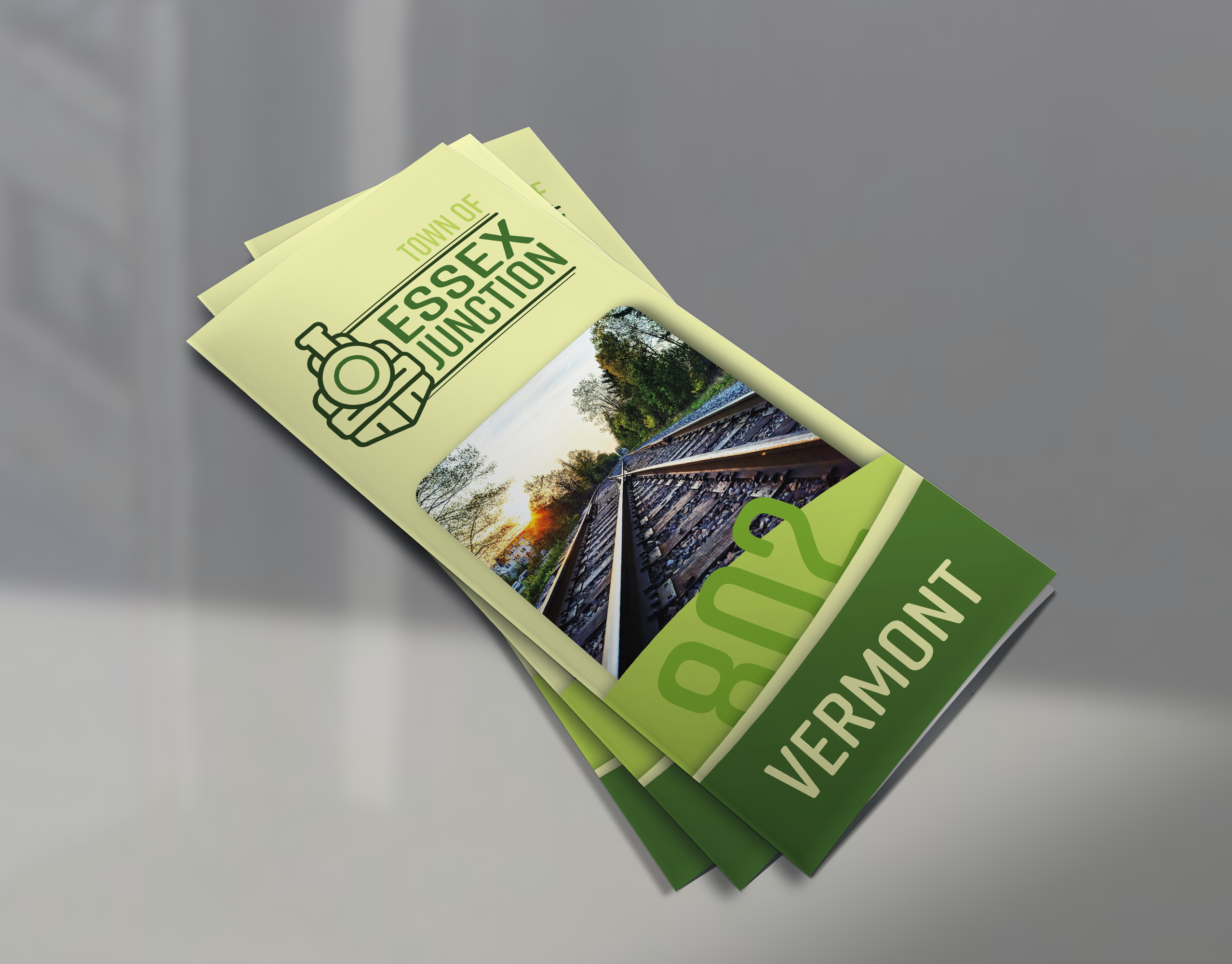
For this rebrand, I developed a timeless, unique, and clean logo for town representation. The logo has strong elements of the Essex Junction worked in, such as the Train symbol mark. I wanted this design to focus heavily on trains and railroads since the most notable characteristic of the town is it’s abundance of train tracks and railroads, hence the name Essex Junction. I went with an older train design, as opposed to cargo train, or Subway. I made this decision because my design gives the logo a timeless and classic appeal without making it seem too old.
Colors
For the colors I went with varying shades of green. I think that the color green closely represents the state of Vermont with it’s rolling hills and thick forests, and abundant vegetation, Essex Junction is no exception. While the town may not have any mountains, there is no shortage of greenery.
Form
I wanted this design to be more modern with a touch of classic. I designed this logo with round features in mind, every corner and end-cap has been rounded to give a sleek and modern emblem look. The lines above and below the text, fill in empty space to tie the design together, as well as ground the text, and keep it from floating away in a sense.
Although it wasn't used in a real rebrand, I think this project worked my brain in new ways and enhanced my skills in both branding and digital illustration.

