Overview
For this project, the goal was to take my previous project, Essex Junction Rebrand, and incorporate that brand into a brochure. Although the final product is just for practice purposes, the point of the brochure would theoretically be to educate new visitors on the history of the town and unique places of interest.
Design Choices
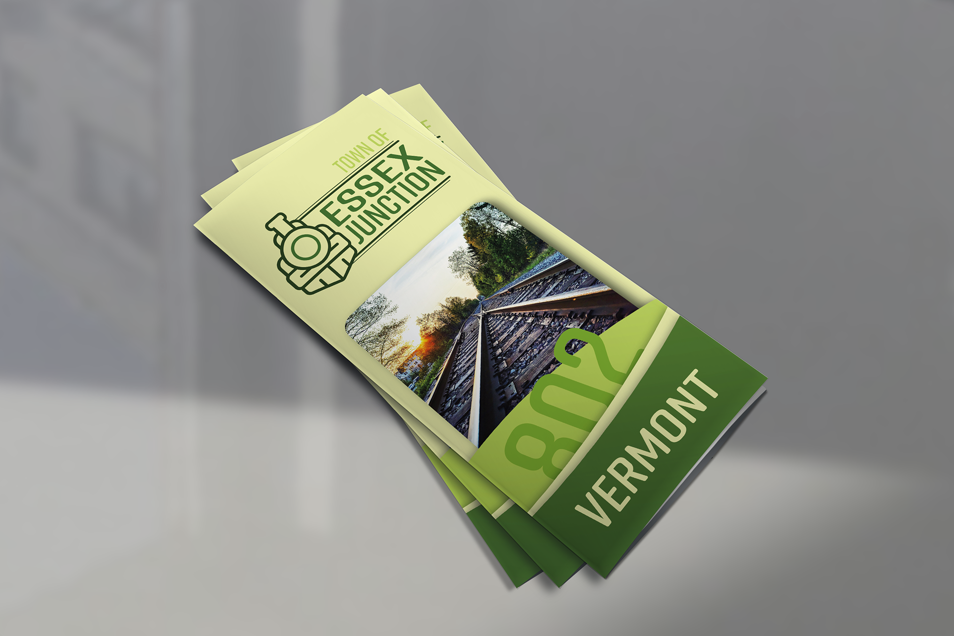
For this project, the general design aesthetic actually came together quite easily. For example, since Essex Junction is a town in Vermont, my first though was to use a green based color palette to replicate the natural foliage of this beautiful state this also worked out nicely because that’s exactly how I developed the color palette for the Essex Junction logo. Therefore, it only made sense to just use the same palette.
I you’ve ever been to Vermont, then you know its a very mountainous state; there are very few flat places in Vermont. And for that reason, I thought it would be a pretty nice touch to add some green hills at the bottom. This was both an aesthetic decision, as well as a technical decision as it breaks up some of the text.
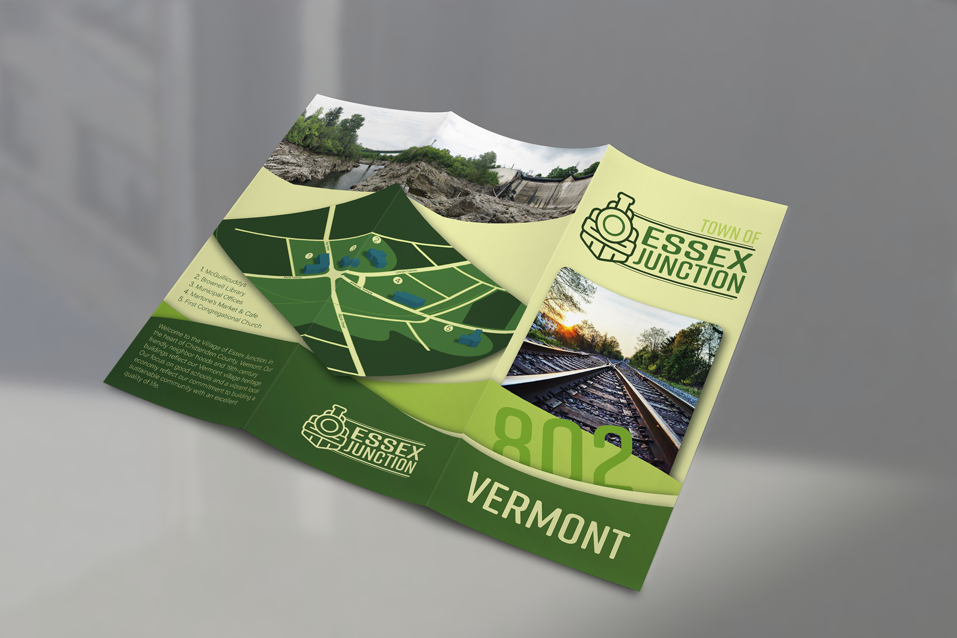
Lastly, I thought since Essex Junction is so small, and the key landmarks are all in close proximity, it would be really cool to add a small map to the mix. This turned out to be a bigger step than I predicted, and I ended up having some fun with it, so the final product came out 3D. I figured something I worked so hard on could use a bit of a spotlight so I decided to have it cover two pages of the brochure, this also made the general layout more engaging.
Challenges
This project was a great learning experience, and it taught me a lot about layout design, but the road to every success comes with challenges.
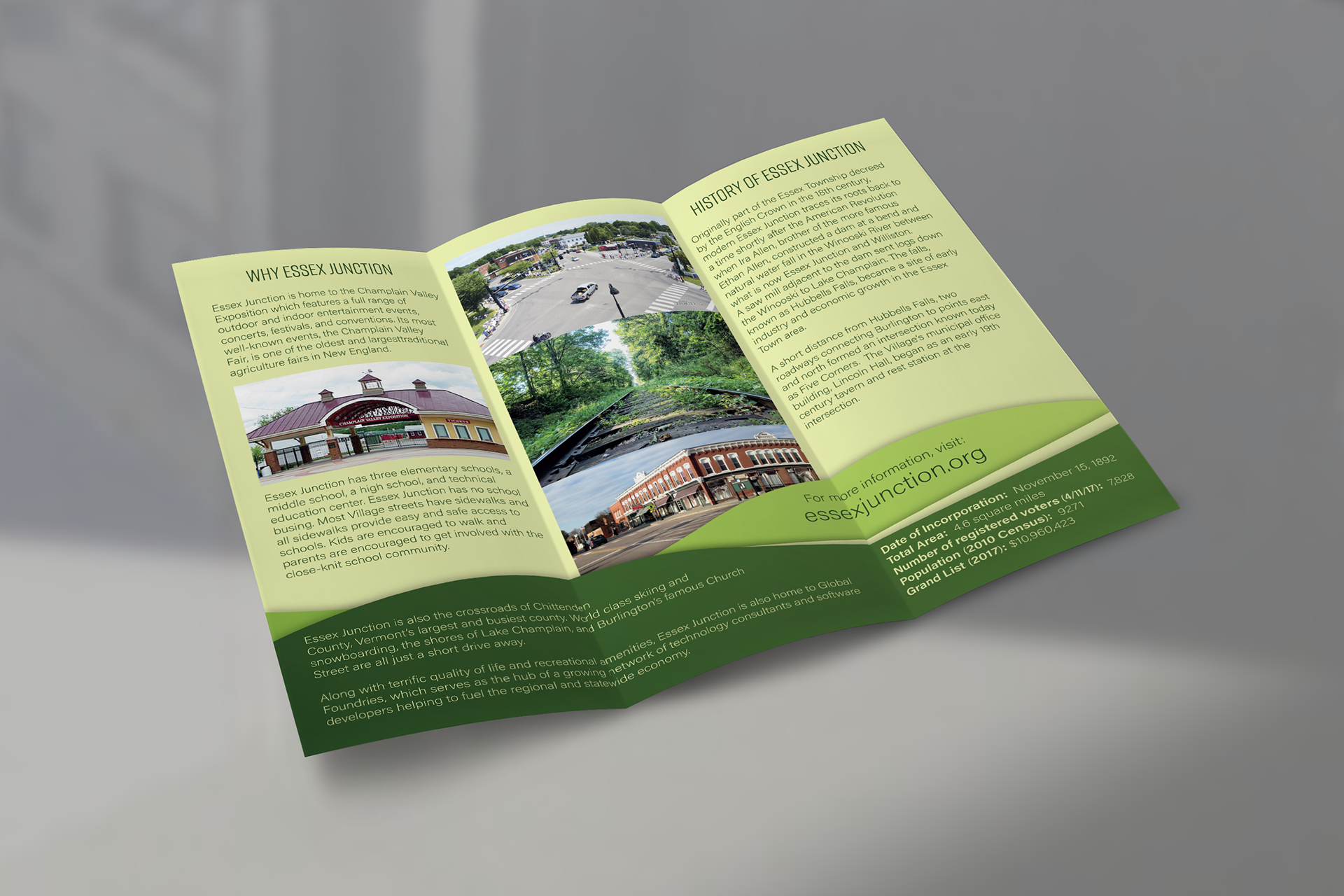
One of the hardest parts of this project was trying to find out how to fit all the content I wanted into the brochure. It was very tricky trying to get everything together in the space provided. In one of my earlier version, I had many more photos included in a collage but the physical size of the document is so small that it would have been difficult to identify each and every picture.
As far as the photography goes, Essex Junction isn’t necessarily a tourist destination, so there aren’t a lot of good pictures to portray it. For this reason, I used a couple photos I could find, but ended up taking a few myself, including the very wide picture at the top. This added a bit of a personal touch for me and I’m glad I was able to incorporate them the way I did.
Although the layout was tough to put together I think it all came together well in the end, and I’m pleased the locations of each asset.
Conclusion
This brochure started as a practice piece, but eventually started forming into one of my favorite works. It wasn’t easy, and I did run into a couple challenges, but overall it turned out really well and it was a great learning experience for me.