Overview
This was a UI/UX-centered project where I was assigned a local coffee shop located somewhere in the US. The specifics of the rebrand was to include a new logo, a new brand, a Keurig® K-cup box design, and several other brand-focused product designs. I was assigned The Vault, a coffee shop based out of an old bank located in Valley City, North Dakota.
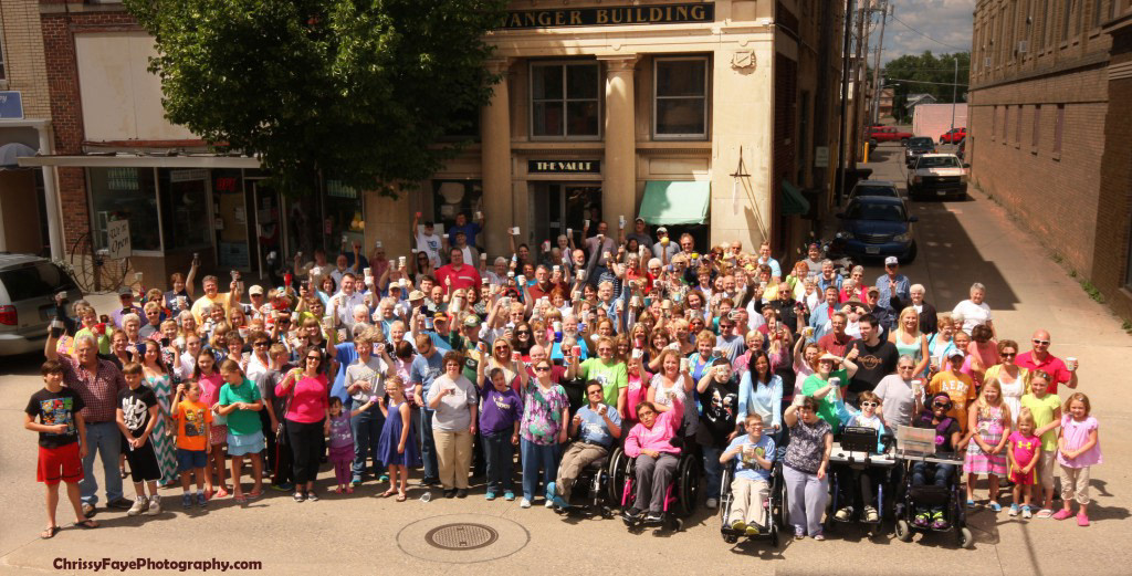
What makes The Vault so unique is that its an establishment driven by an enormous sense of community from the locals and surrounding businesses. The Vault follows a very unusual business model based on the honor system. This means that people come in to grab their coffee and snacks and leave the corresponding amount of money in a wooden cashbox, with no supervision. The Vault also offers live performances, a local art gallery, and books for purchase, making this unique little coffee shop a haven for the arts.
Colors
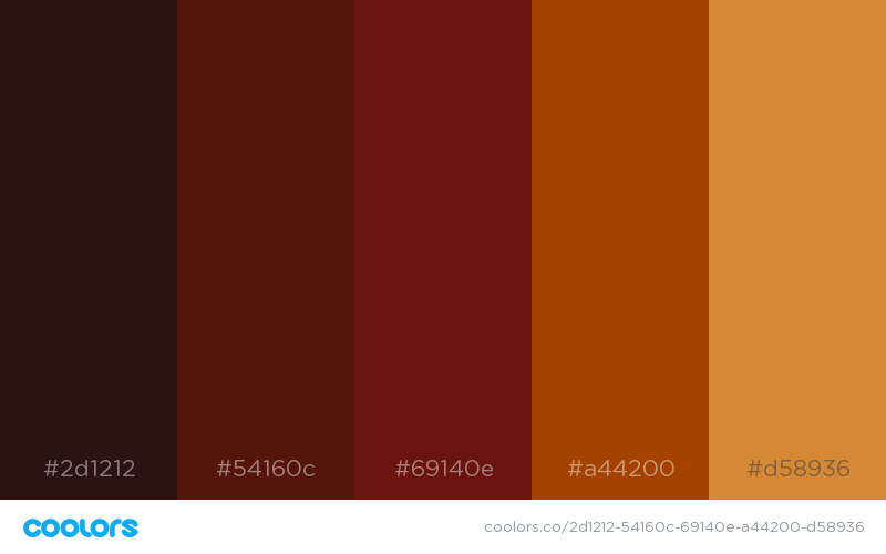
The color scheme for this project played a very important part because it would later affect how each piece came together for the final product. Based off the fact that The Vault is run out of an old bank and has a very tight hold on art culture, I immediately wanted this brand to closely resemble a more vintage and rustic feel. This, coupled with the fact that the target age range is very wide, meant that whatever theme and color palette I chose, had to appeal to younger and older audiences.
The final decision was made after all of the previously mentioned factors led me to the classic Steampunk aesthetic, and I knew that I wanted the colors to reflect this. The final brand colors came out to be a warm mix of browns and golds to represent wood, leather, and metal.
Logo
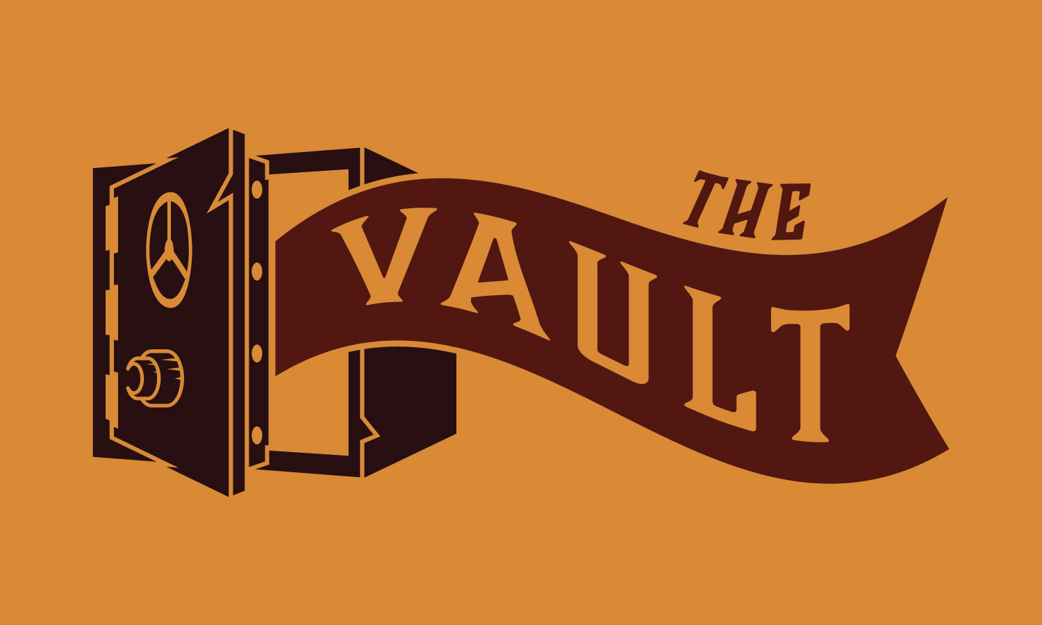
There were a lot of different places I could have gone with the logo design for this project, but an element of this coffee house that had fascinated me from the beginning, was the fact that it was run out of an old bank. I knew almost immediately that I wanted to incorporate the bank aspect into the logo (which of course lends itself to the name), so after playing around with a couple of ideas and sketches, I eventually settled on a simple illustration of a safe.

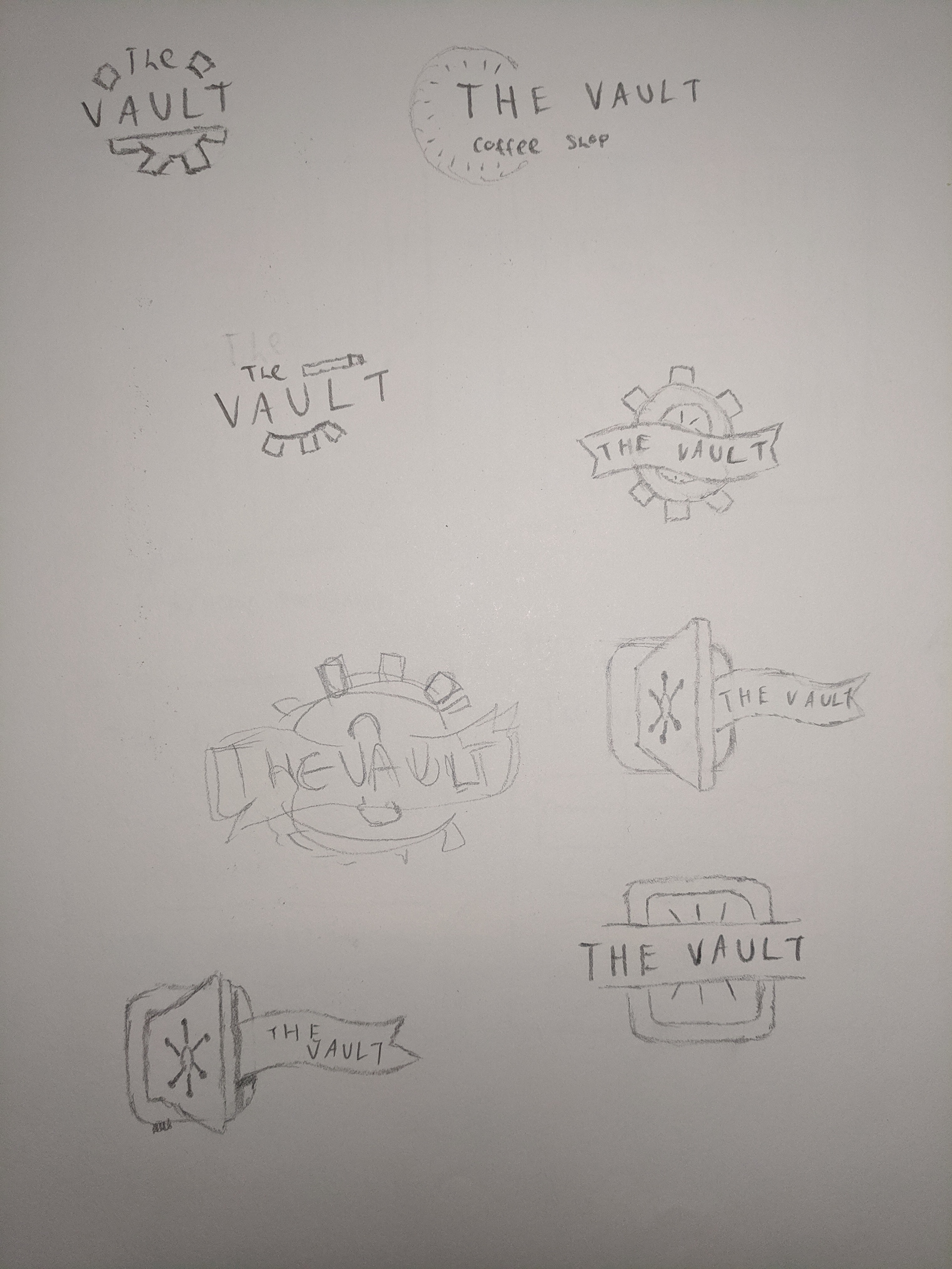
The original design for this logo featured a similar safe design with the text cleanly placed next to it, but there were a couple problems right off the bat. One of the problems that I encountered was that the overall design almost looked to minimalist, so I reworked the safe to be more three dimensional. This new version also featured an open door as well as added details, to make it a comfortable mix of modern and vintage. Another problem that I encountered was the fact that “The Vault” was just floating next to the safe and didn’t tie itself into the design well. I solved this by incorporating a banner coming out of the open safe.
The logo also comes in a reverse version as well as black and white versions to allow the logo to be used in a variety of applications.
Packaging
One of the most exciting parts of this project was taking our newly created brand and applying it to some product packaging, the most complex being an official looking Keurig® K-cup box. This part really allowed me to get in touch with my creative side, however one of the more challenging parts includes accounting for all of the little details that all Keuring® boxes have, such as the logo, k-cup count, package volume, etc.
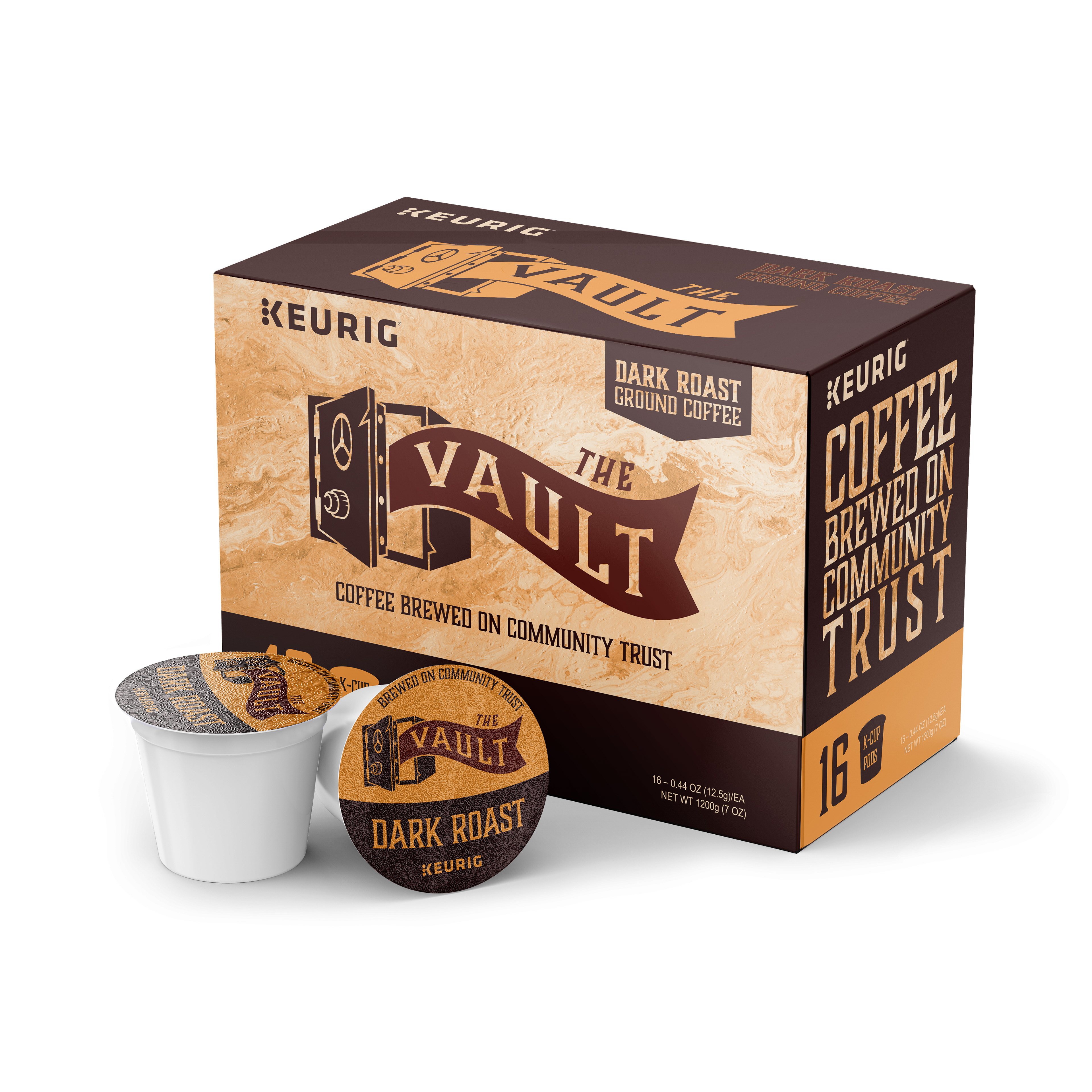
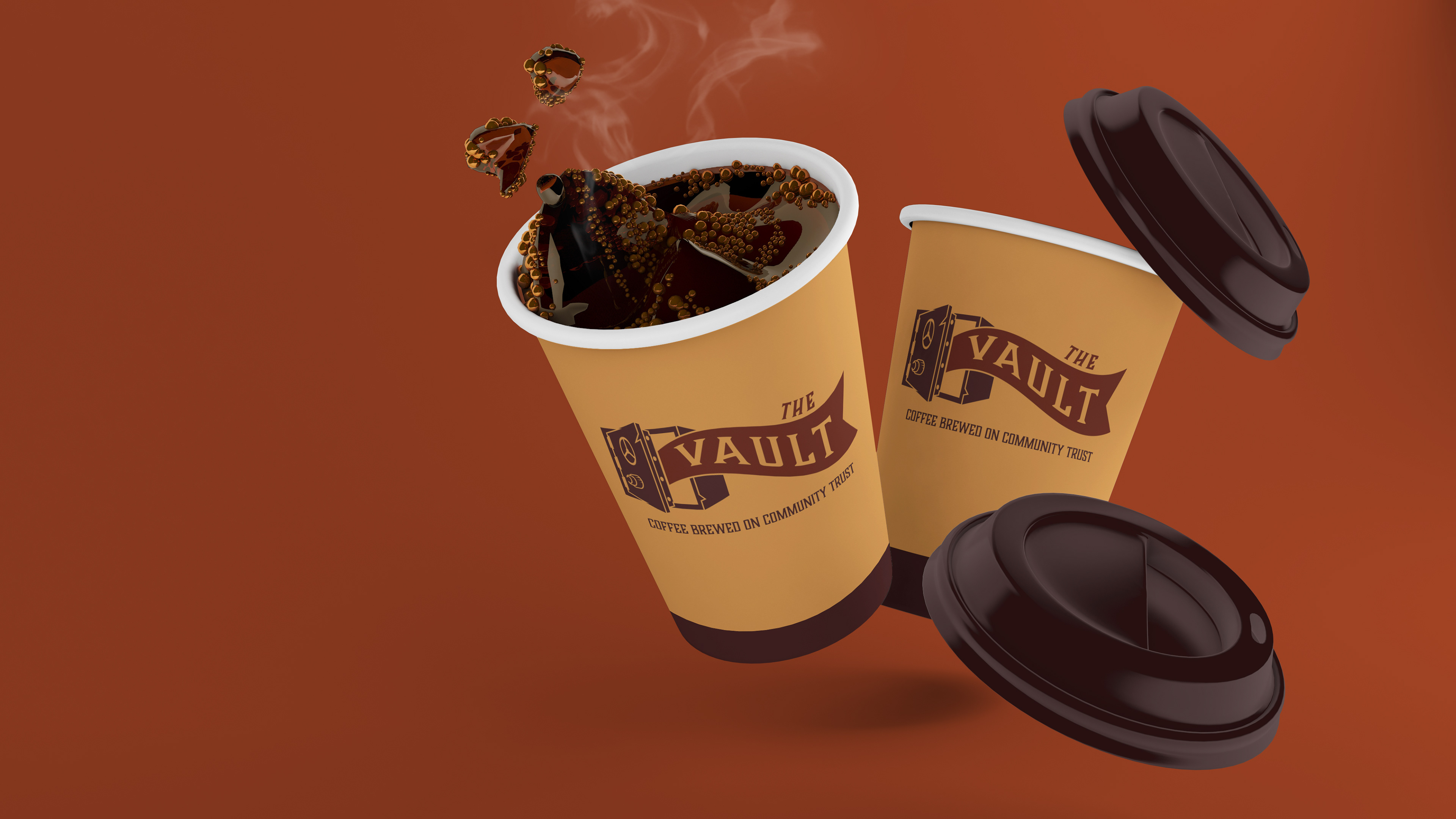
This brilliant design features the new brand colors, fonts, logo, the new tagline: “Brewed on Community Trust”, as well as a matching k-cup design. The backside of the main box also features a nutrition label, barcode, contact information, ingredients, and a flavor description.
This part of the project definitely took the most time, but I believe it to be the most visually engaging and rewarding.
Other Products
The Keurig® coffee box is a great physical manifestation of the new brand, but the fun doesn’t stop there! Along with the k-cup box, I have also designed a plethora of other consumer products to carry the brand and establish traction in the surrounding community. Such products include a disposable coffee cup design, coaster design, business card design, ground coffee bag design, and of course a premium apparel design.

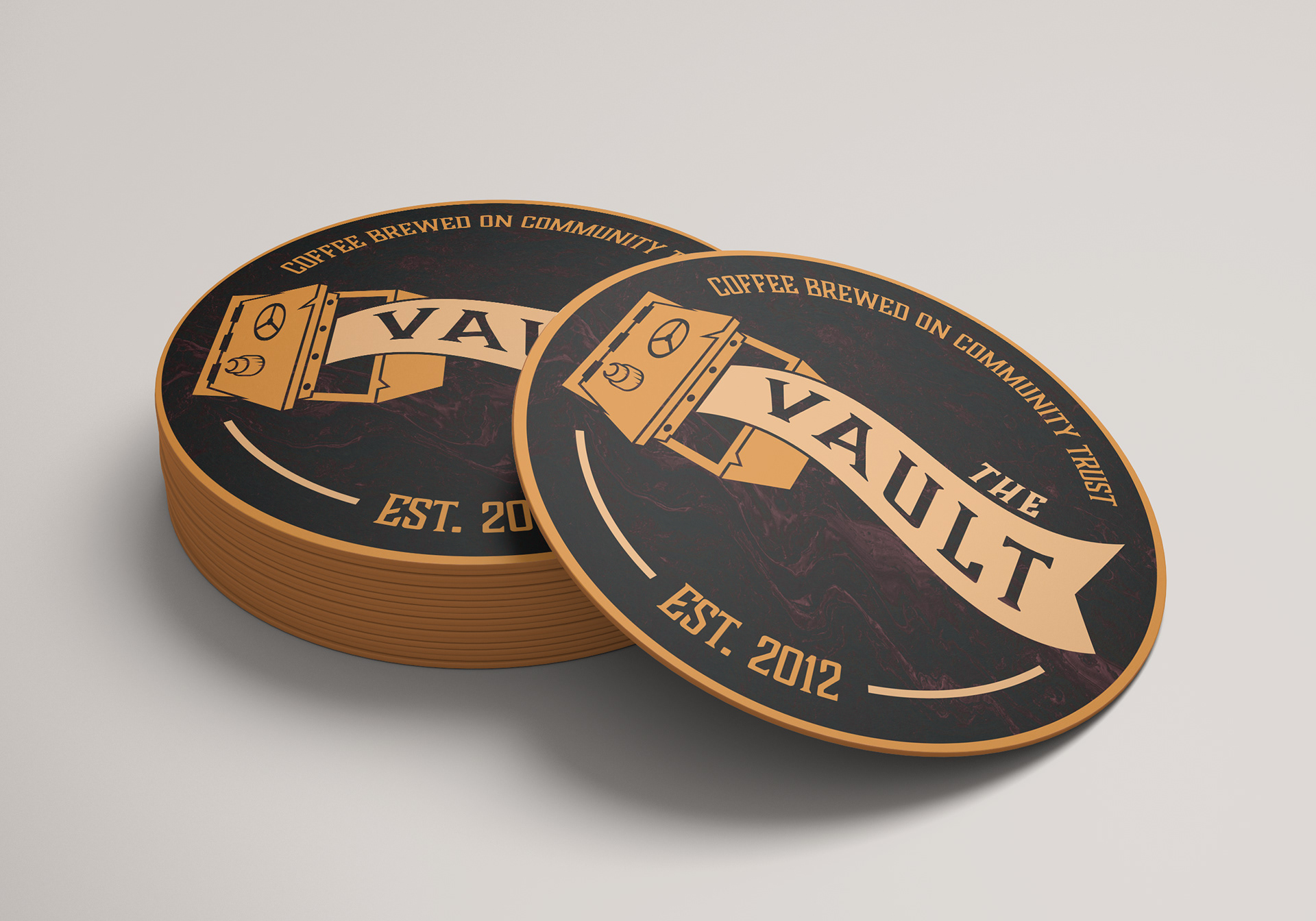


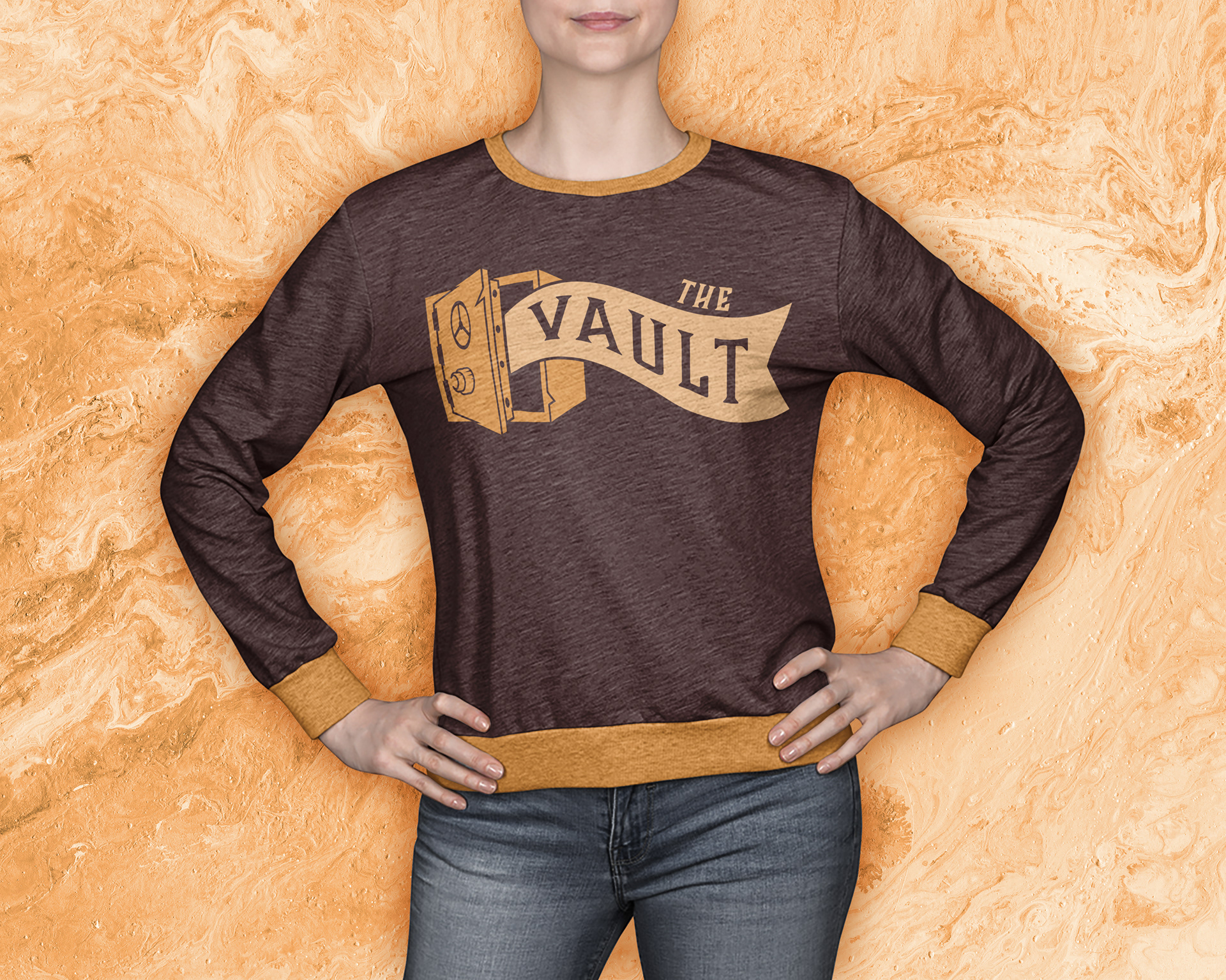
Most of these products were designed with the idea of a rewards system or online shop in mind.
Conclusion
This project was an absolute blast to work on, and I am thrilled with how everything came out in the end. It presented many challenges to me, and all the moving parts made things quite interesting, but that is exactly what made adding the finishing touches so rewarding. This is definitely one of the projects that I’m most proud of, and I look forward to making similar work in the future.