The Castleton Content Lab (CCL) is a graphic design club at Castleton University, that uses industry-standard tools and techniques to assist local clients big and small with all their design and media-related needs. We take a very collaborative approach on all our projects, letting everyone's voice and opinions be heard, as well as voting on who gets to operate the software on a given workday.
This project all started when a close contact of the Content Lab, Nic Stark, said he was working with the small town of Poultney, Vermont to develop a new visual identity, and asked if we'd like to have any part in the process. He said they wanted a logo to start with a complete brand package following. They wanted something clean and minimal for a logo, but not too modern; it needed to maintain that quaint and classic feel Vermont towns are so well known for. We happily agreed, and as the newly elected president of the CCL, this was the first large-scale project I contributed in.
Before we could put anything to paper, we needed to do some research of our own to find a strong direction for this project. Initially, Nic had provided us with some examples of typography found throughout the town which highlighted its rich history in printing, that we could use for reference in the design process. These images gave us a good feel for the town's aesthetic, but we felt a proper walk around the town was necessary. We followed this up with a brainstorming party to summarize and discuss our thoughts, which led to a big white wall, filled with every word that our experience in the town made us think of. This wall was our physical manifestation of the town of Poultney.

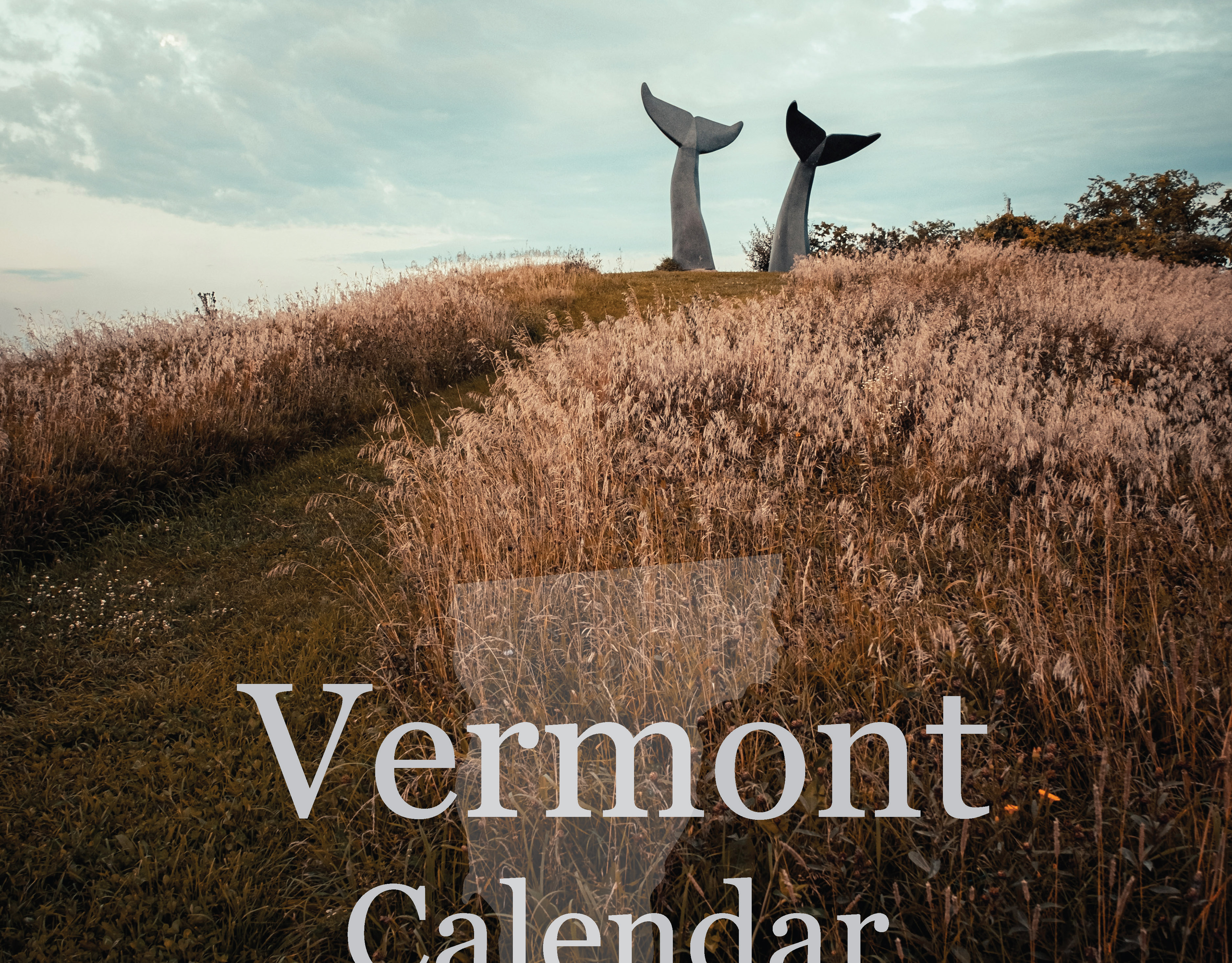
Example of typography found throughout Poultney
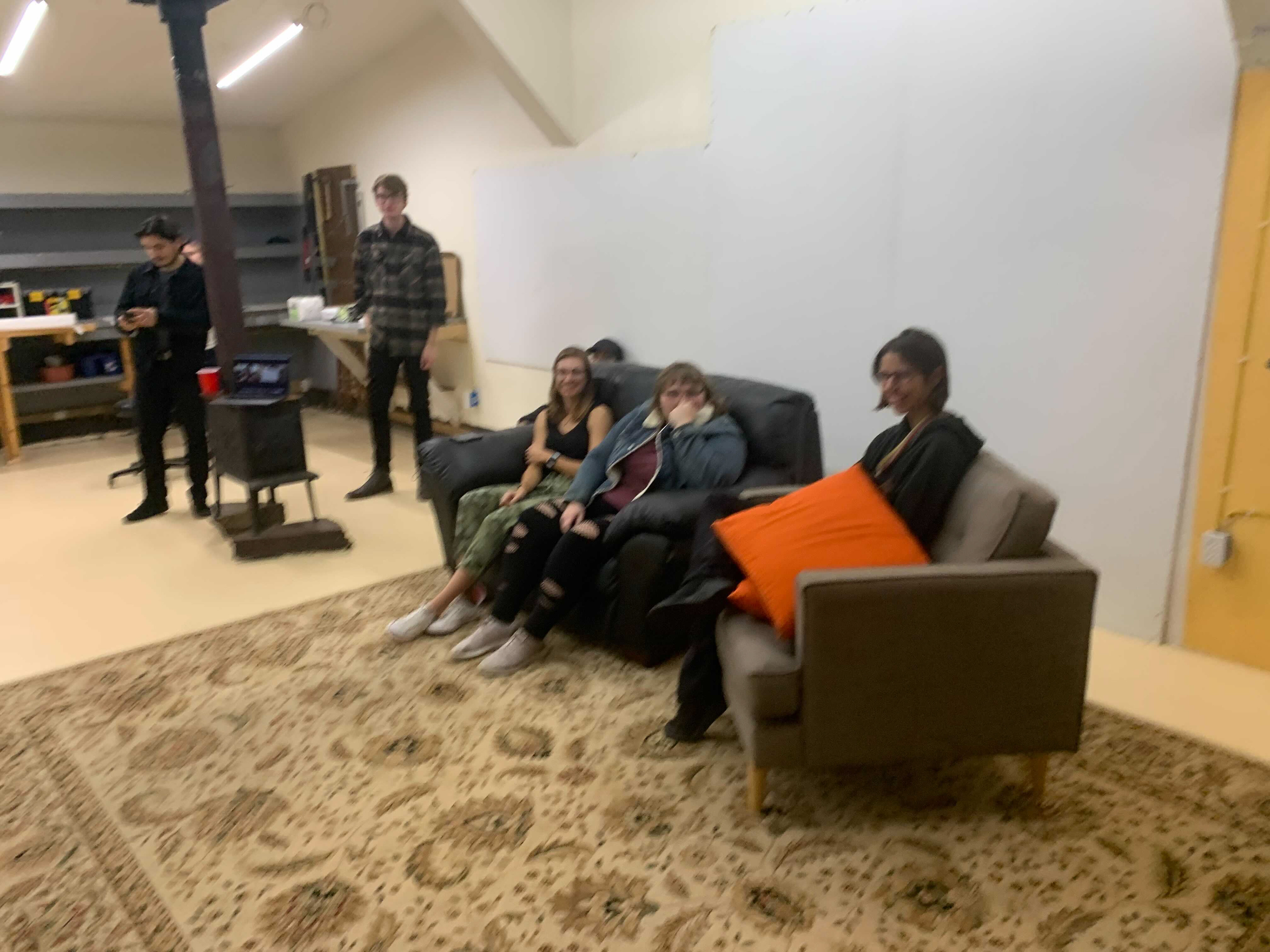
Getting ready to brainstorm
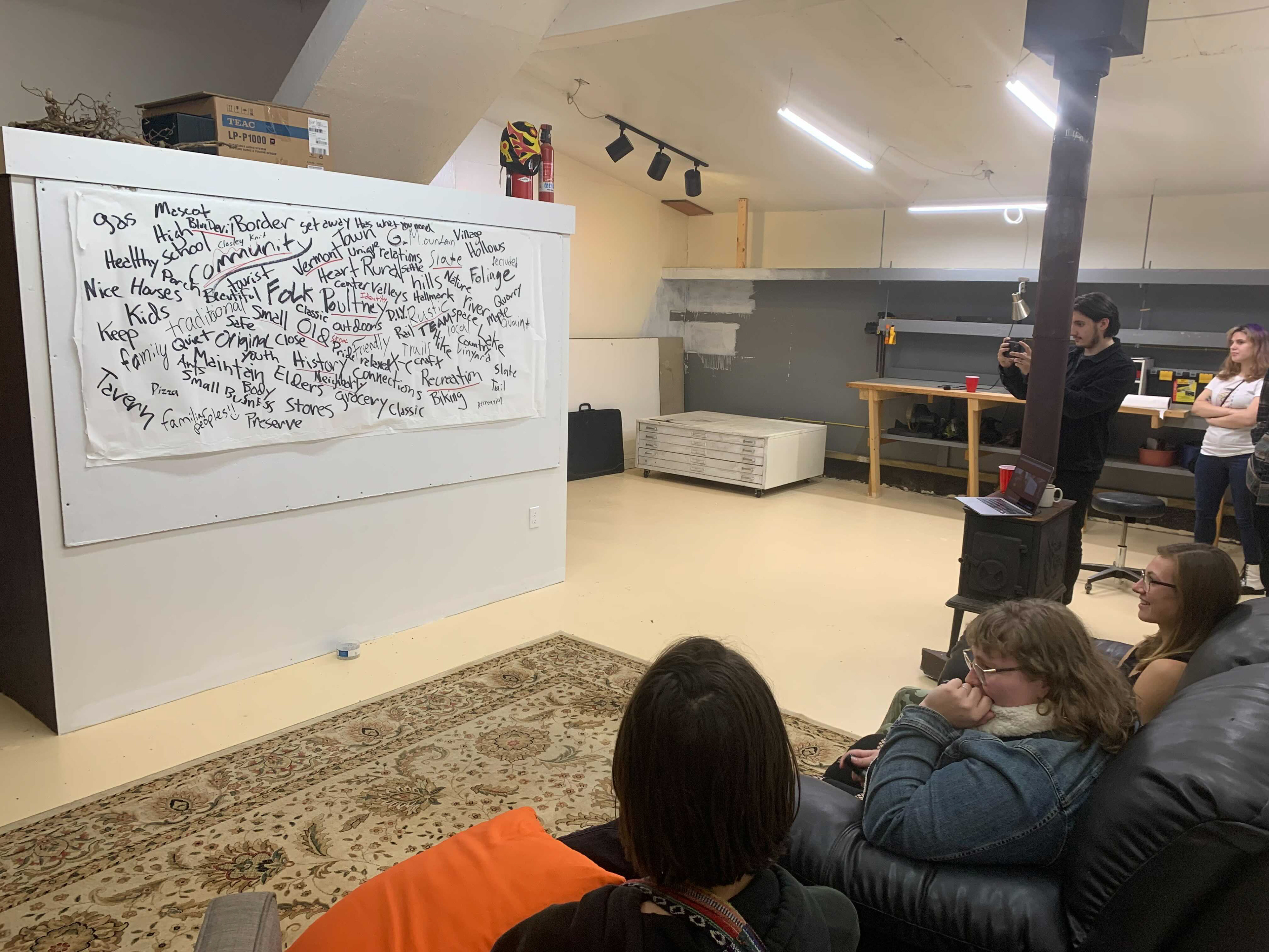
Everything that makes us think of Poultney

Everything that makes us think of Poultney
With our new perspective on the town and plenty of directions to explore, it was time to get designing. I jumped straight to typography first, recognizing Poultneys history in the printing industry, this seemed like a good starting point. After some rough collaborative attempts, I walked away with the first solid direction.
My take on the logo was awkward, unrefined, and lacked substance, but it was fun and quirky; two words that I felt truly represented Poultney. This provided an excellent foundation to work from.
Hours of tweaking and shifting, adding and subtracting passed. As a group, we pulled my logo apart and put it back together again until we finally felt we had something to show our contact.
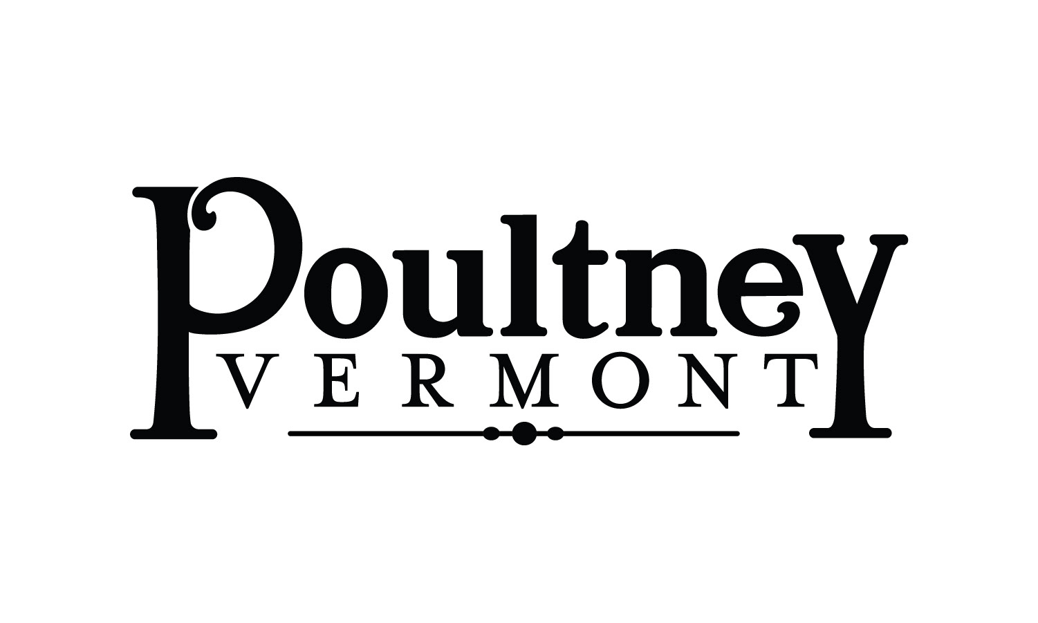
The final logo concept that was presented to the select board
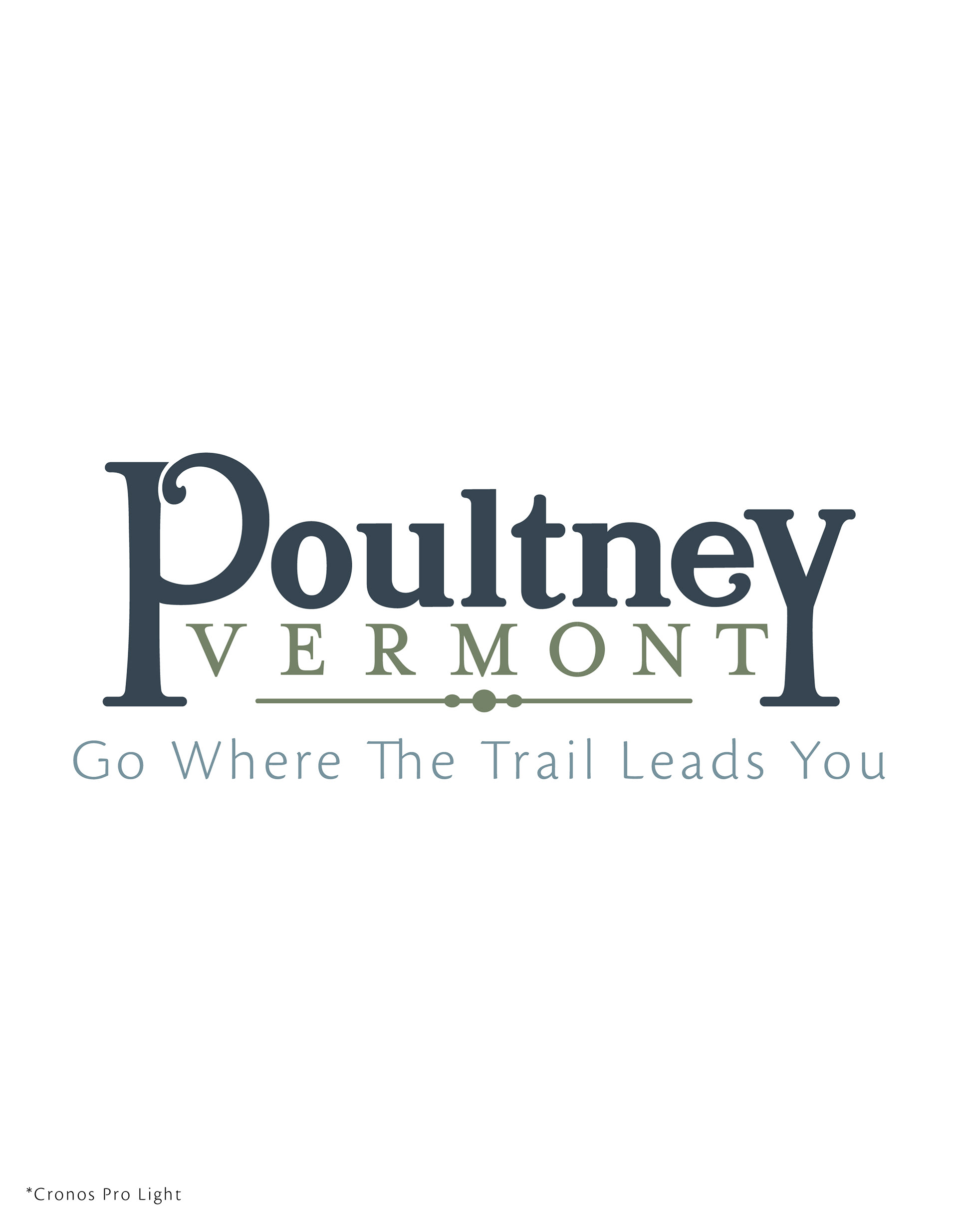
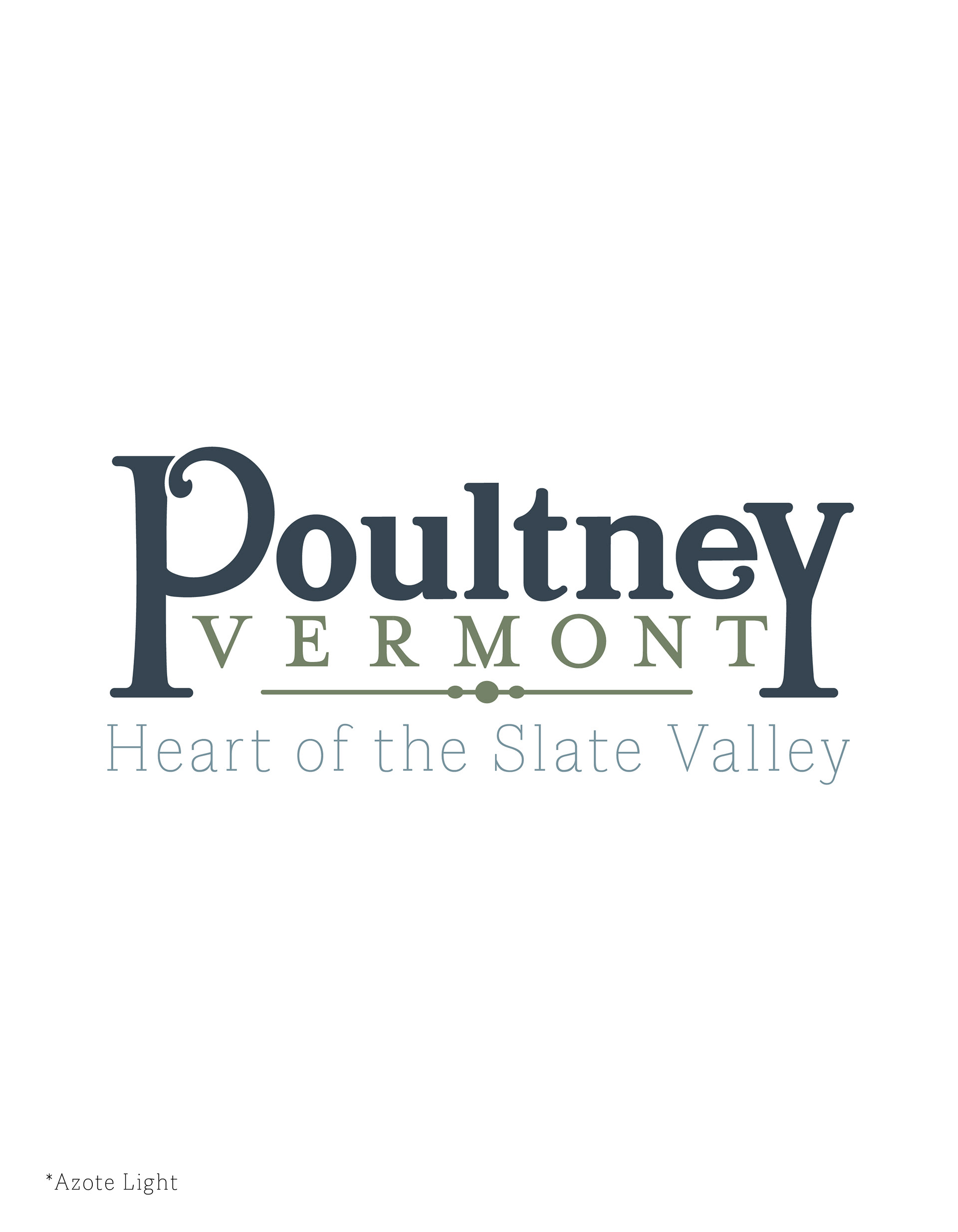
Unlike the previous comps, this logo is much more refined with significant enhancements to structure. It's strong, clean, but classic like a Vermont town should be. The thick stems of the "P" and the "Y" solidly ground the logo as tree trunks would, adding strength to the design and representing Poultney's natural side. Elements like the curls in the "P" and the "e", and of course the long decorative bar at the bottom, bring back that fun and quirky vibe synonymous with Poultney and directly represent unique architectural features found throughout the town. The decision to put "Vermont" in the logo was an important one, and we felt that it needed to be there to emphasize its identity, but in such a way that it wouldn't visually detract from the town.
Nic appreciated our efforts and loved the final result. He said that he tried to find ways of tweaking or slightly improving it for presentation, but every shape and space was so obviously intentional that he couldn't find fault.
With the hardest part out of the way and circulating various select board meetings, it was time to get started with some other brand elements. Besides the logo, other things we would need to develop include logo colors, a full brand color palette, brand typographic layouts for both print and web use, as well as some potential slogan ideas.
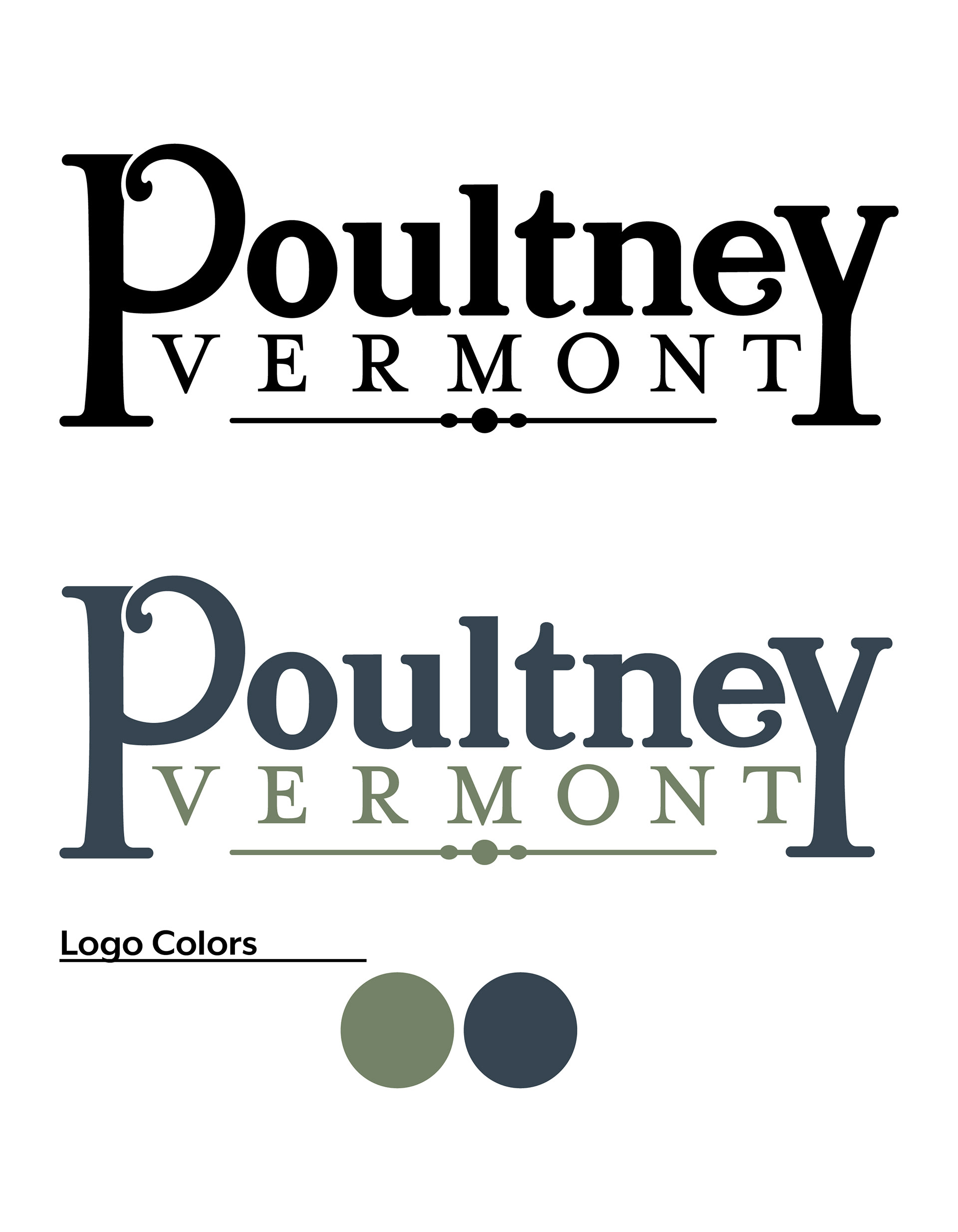
We got started on the colors and after plenty of tweaking/bickering felt that a deep slate blue and pale green would sufficiently serve as the primary colors for the logo, representing both the areas booming slate industry, as well as the town's known outdoor recreation. Light grey, bright green, and gold followed close behind to act as accent colors behind the whole brand.
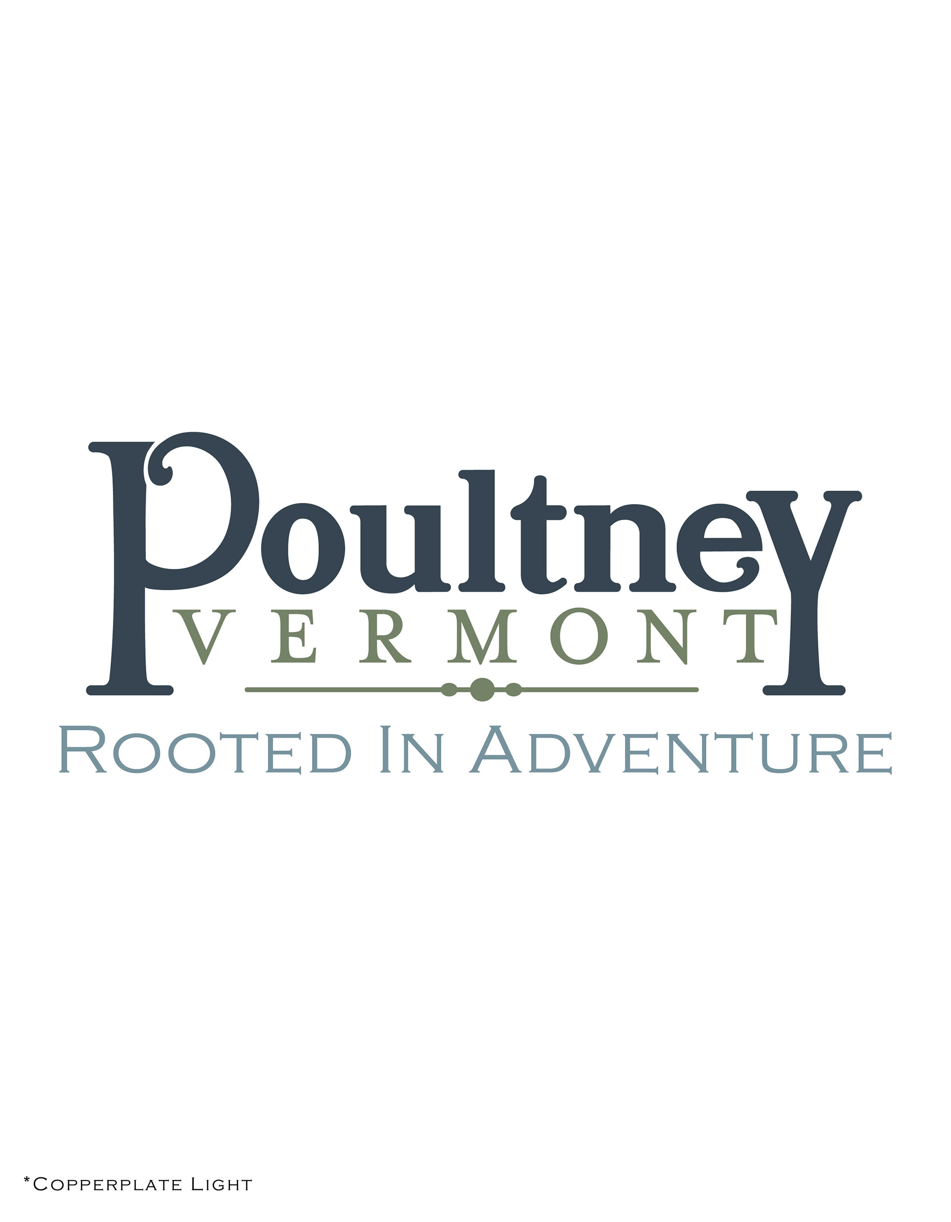
The slogan challenge was largely settled after a long collaborative brainstorming party where 20+ slogans were conceived and the lot was unanimously narrowed to our 4 best contenders: Rooted in Adventure and Go Where the Trail Leads You, both catering to Poultneys outdoor economy, Rural at Heart referencing Poultneys strong and passionate community, and Heart of the Slate Valley, a good suggestion from Nic himself.


Now, the hard work is done, the packet has been submitted, and all we can do now is wait while our pride and joy gets passed around more select board meetings. As of May 2022 when I'm writing this, we've received nothing but good feedback from those reviewing are work but no definite decision yet.
Regardless, I would consider this to be one of my most exciting, educational, and rewarding design experiences yet. I've learned lots about the design process, industry requirements, town planning, and more. But most importantly, I got to see a project of this magnitude develop from start to finish over the course of nine months! The result is a piece of work that will remain one of my most influential for a very long time.