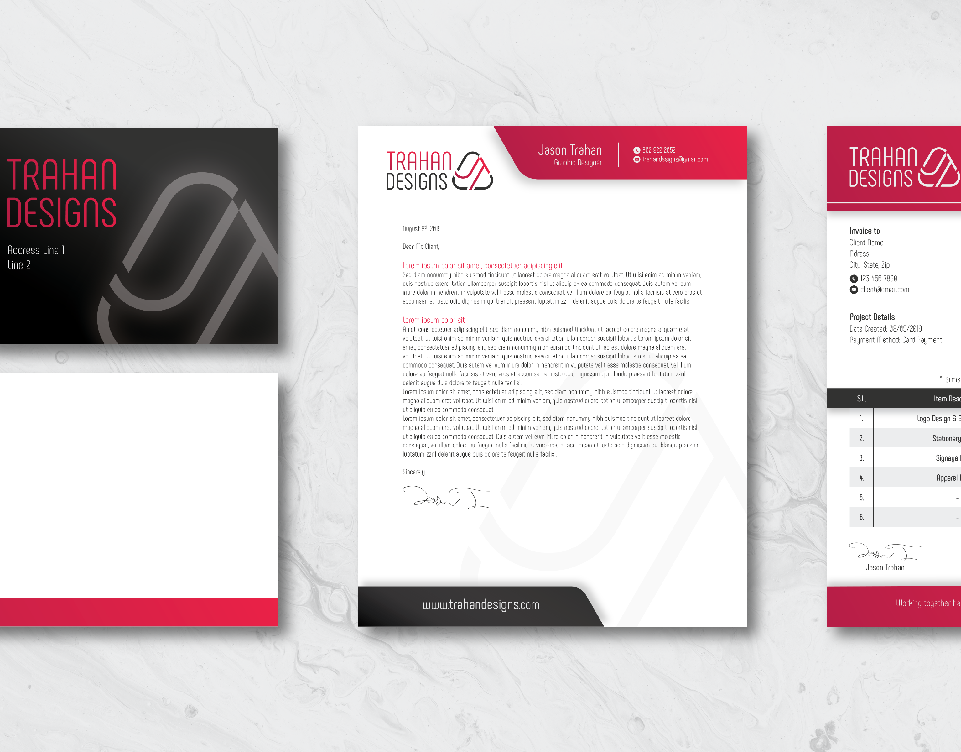
Overview
The goal of this project was to create a professional identity for me as a designer. I had to take different elements of my personality, and design style to develop a brand that would eventually be used to sell my skills and turn my passion into a career.
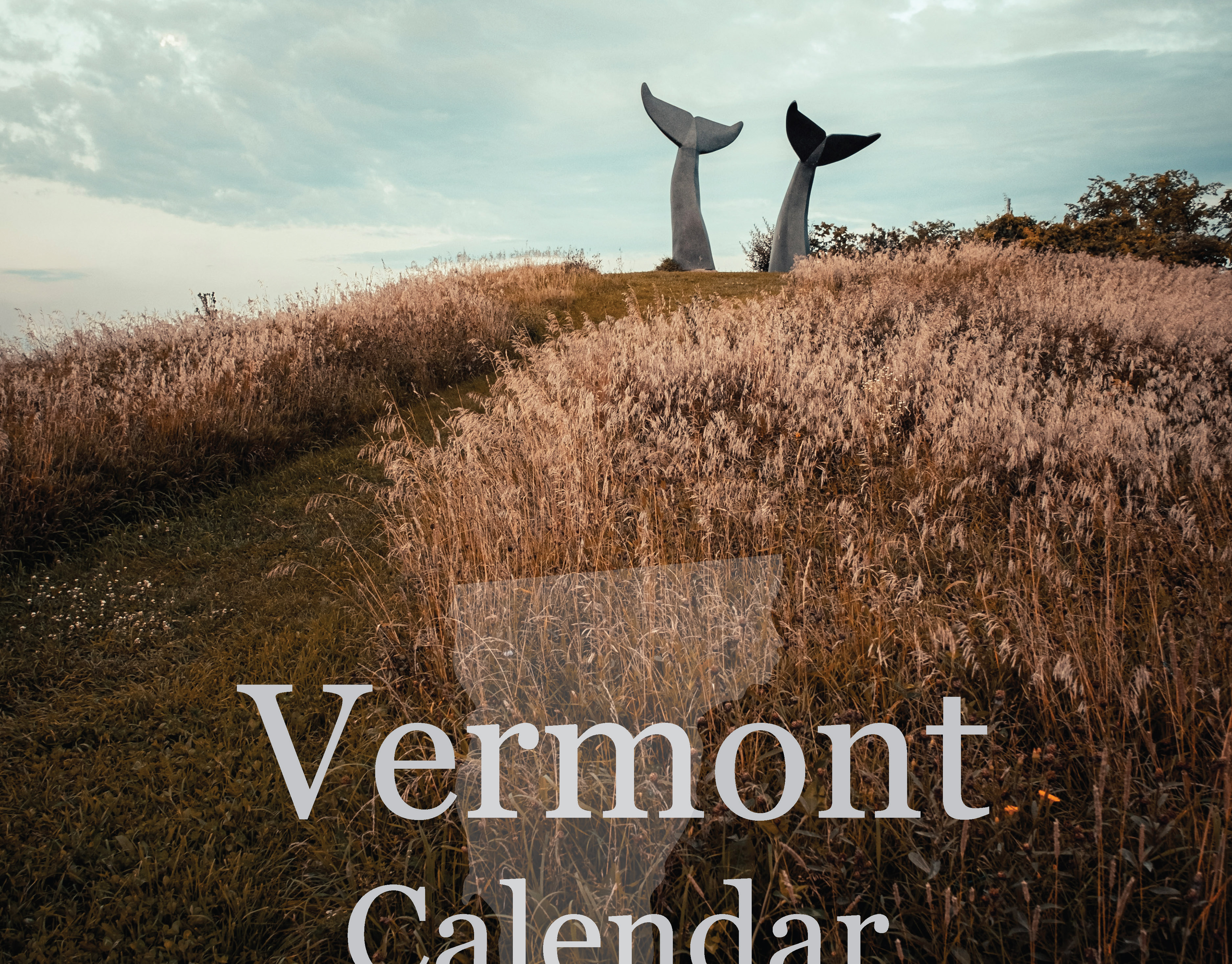
This was something I had achieved years prior, in the Design and Creative Media program through the Center for Technology Essex, in Essex Junction Vermont, but as my skills have enhanced and I have grown as a designer, It was time for a rebrand.
Concept Design
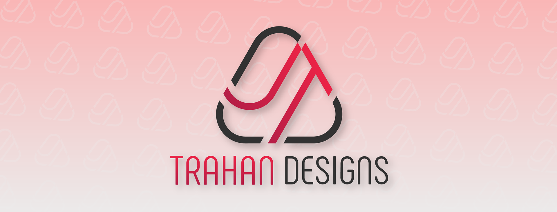
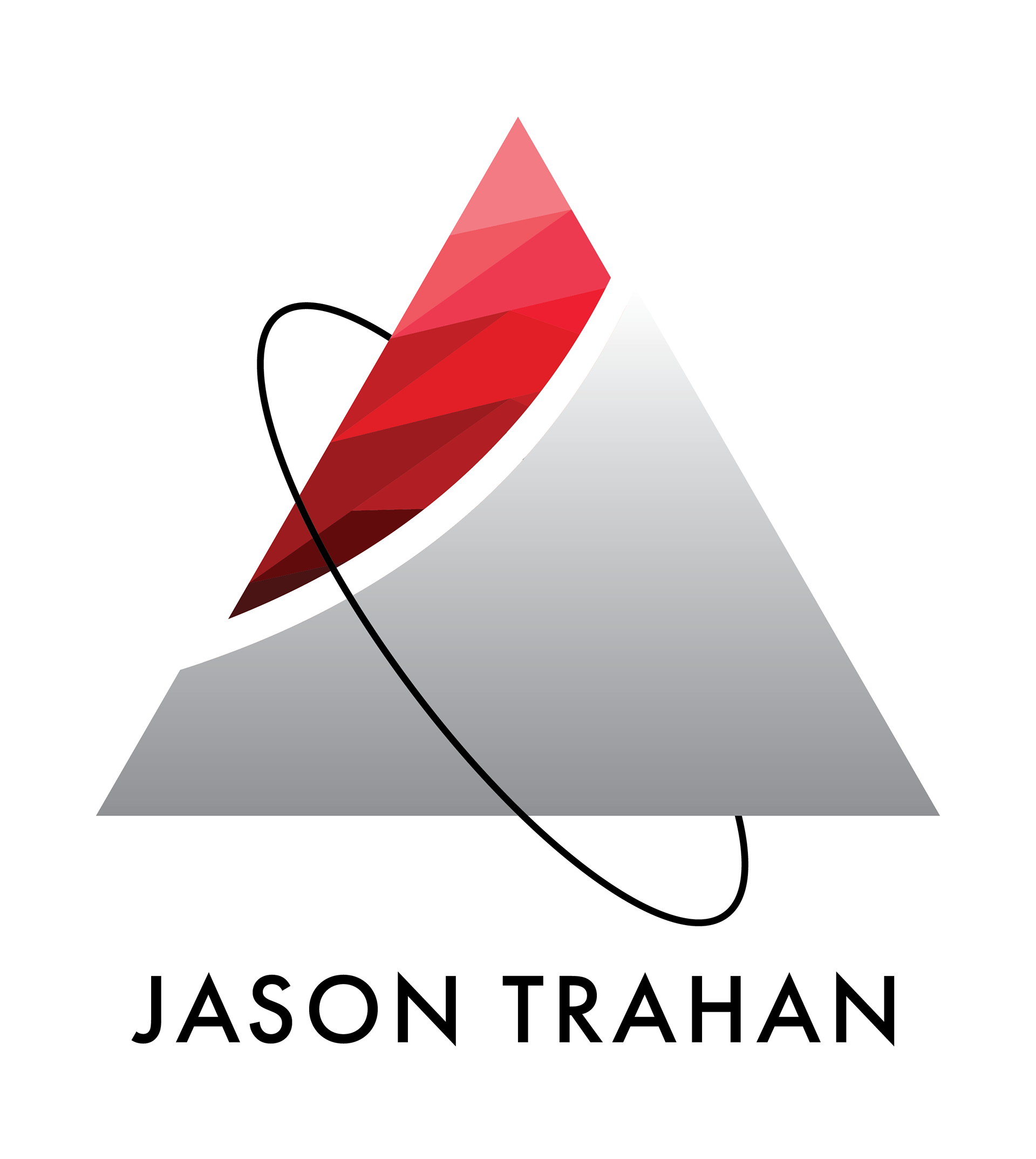
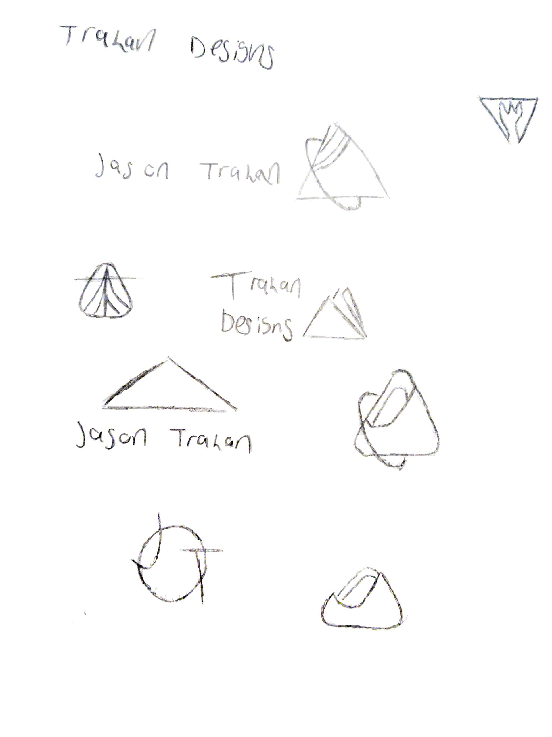
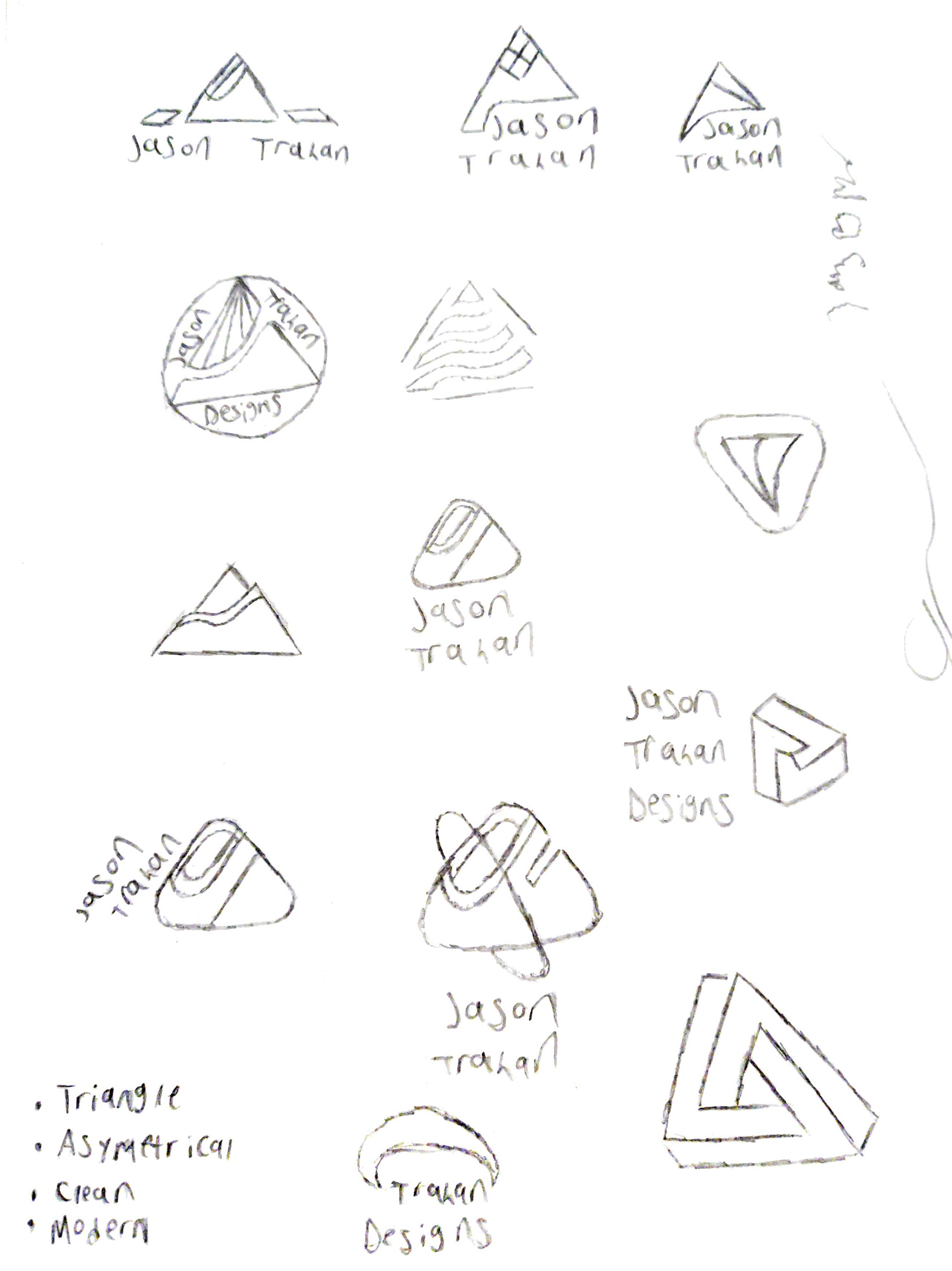
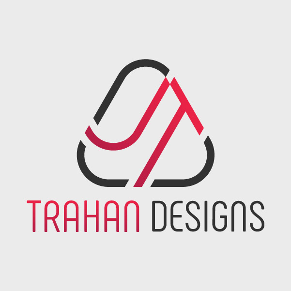
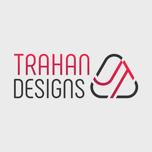
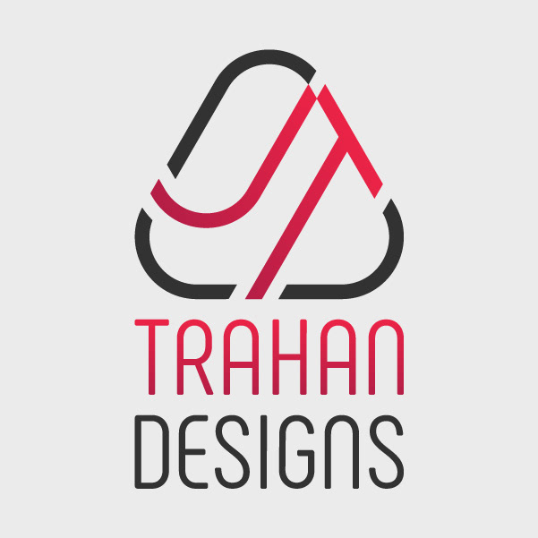
The first step of the process is obviously sketching. I wanted to maintain the basic triangle shape because the triangle is the strongest shape and this is a direct reference to my art style which is very geometric and structured. After playing around more with the previous shapes, I found that the arc’d line in the middle and the other line I had placed, seemed to loosely resemble the letters JT (my initials), so that definitely seemed like the right direction to go in. I also decided to round the corners for visual pleasure and to add a touch of modernity to my design.
Once I narrowed in on the ideal sketch, it was then time to throw it on the computer.
Colors
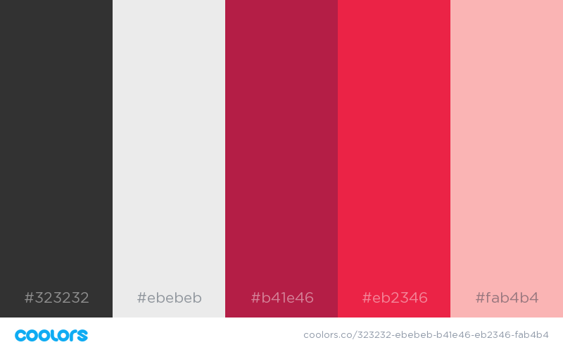
As far as the color palette goes, I went with a similar scheme as the previous logo, utilizing two different shades of red to create a rich gradient and a slightly off shade of black and white to make the brand stand out. In the brainstorming stage, I decided to use such similar colors from the old logo because I love the modern, minimalist aesthetic that black and white bring to the design world. Red was also a great way to add the splash of color and the touch of aggression that I was looking for. Additionally, red is my favorite color. Later on, I also added a light pink shade to be used in other branding applications.
For a moment I actually almost threw out the red for a similar orange gradient, and while I still adore the effect that orange brings with it, I came crawling back to red when I realized that it’s just an overall better fit for my brand.
Final Result
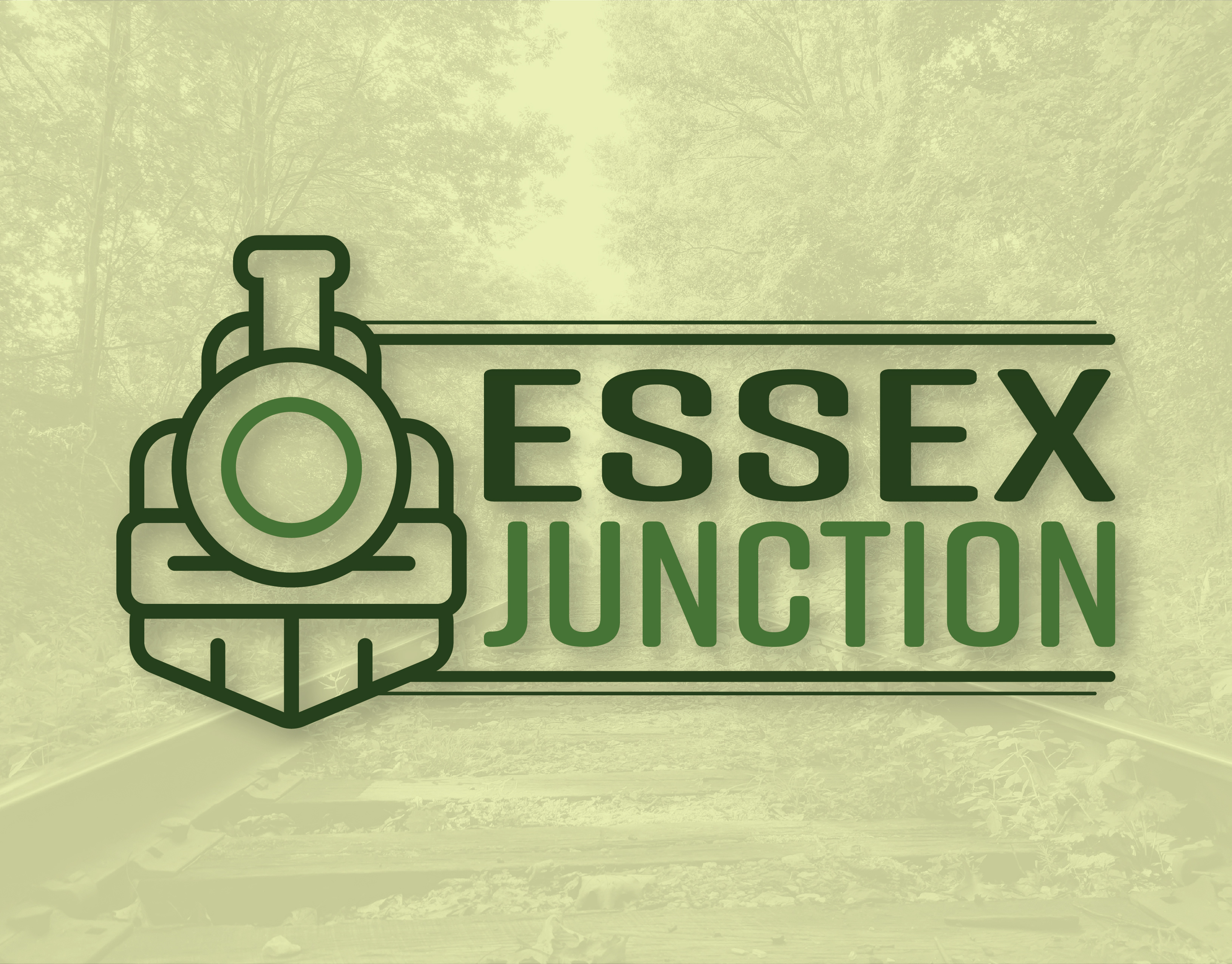
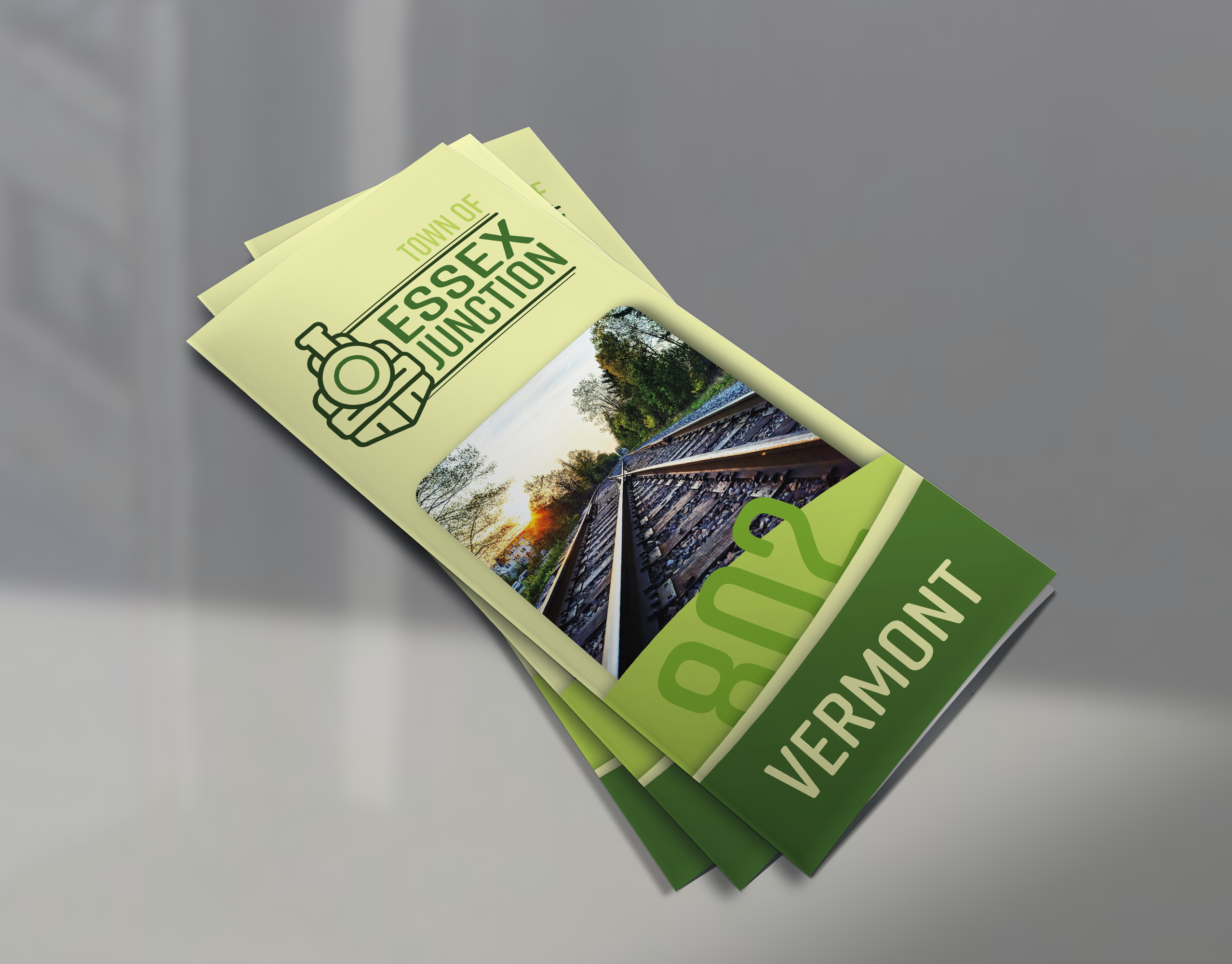
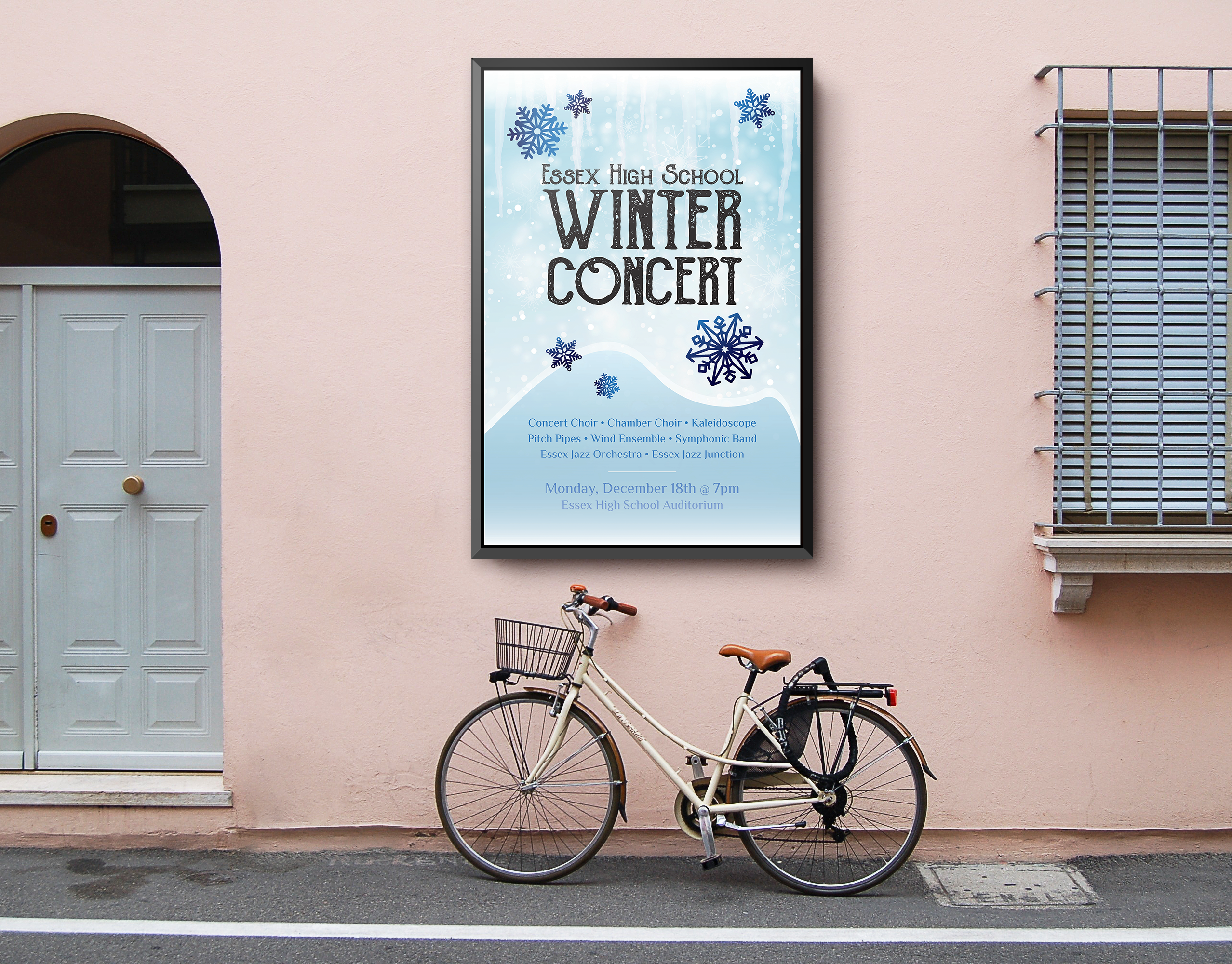
When I was brainstorming the project, I really wanted a logo that could be used in multiple different ways and on a plethora of applications, and that is something that I think I’ve managed to pull off fairly well. I have taken the official logo and designed multiple variations to enhance its adaptability in different situations. The result of this consists of the official combination mark, a more vertical version, a more horizontal version, and a stand-alone symbol mark. The logo colors can also be altered to work on darker applications as opposed to lighter applications.
Conclusion
Overall I am extremely pleased with how this project turned out, and although there were some tough decisions along the way, I believe that this logo is the perfect representation of myself as a designer and an accurate manifestation of my creative capabilities. While my old logo served me well in the early stages of my design education, I’m happy to put it to rest and embrace my new brand for years to come.