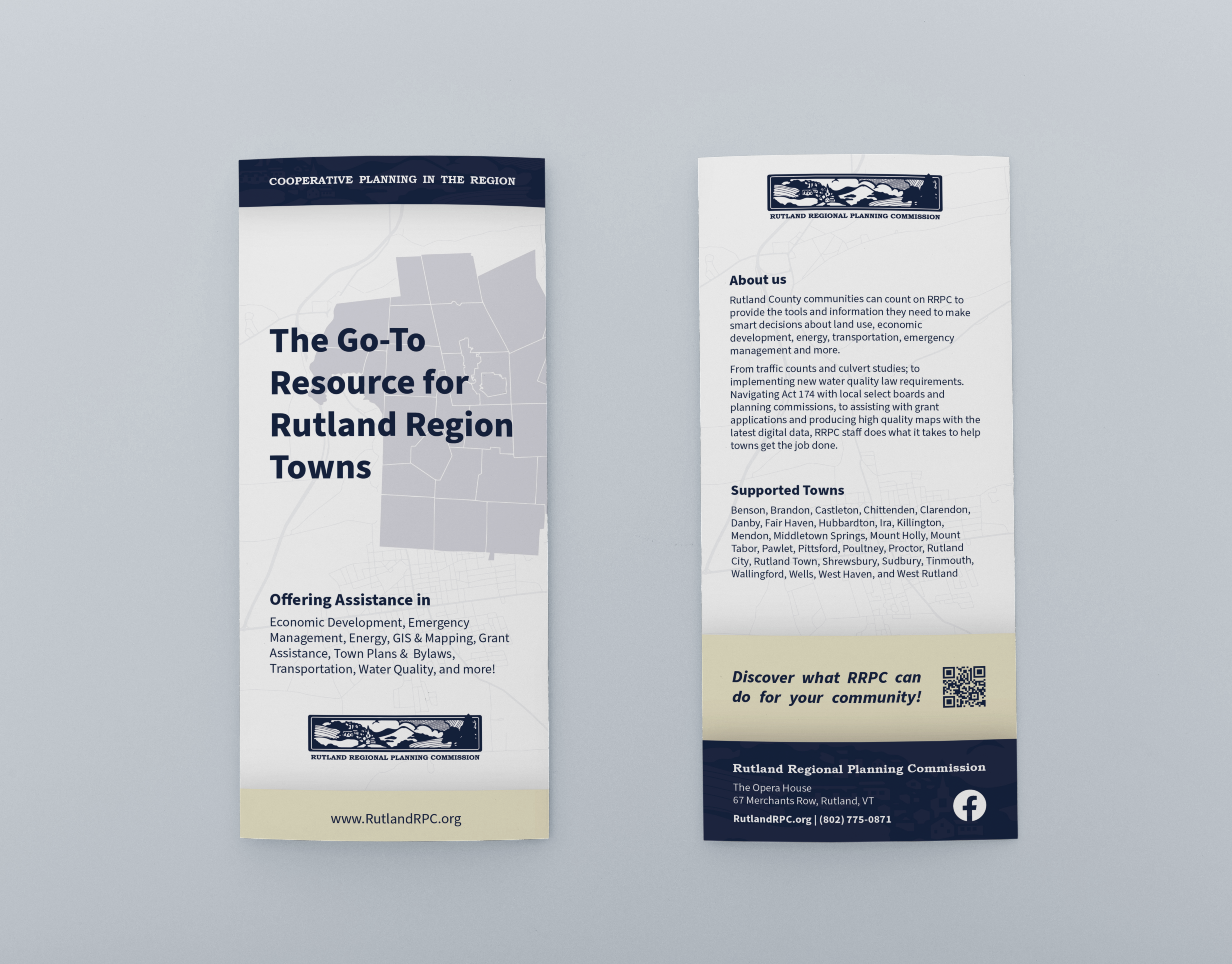
The Rutland Regional Planning Commission (RRPC) is an accomplished regional planning and economic development organization, serving 27 towns in the Rutland Region of Vermont. Here I was a graphic design intern from January 2022 to May 2022, handling all their brand work and graphic needs.
Adding to my list of new company materials, I took it upon myself to design a simple RRPC brand style guide. This would be a brief packet outlining the core assets behind the RRPC brand. Things like color, typography, and logo usage would get their own page containing in-depth information on each subject like color values and font sizes.
The goal of this packet is to give all the different brand assets a single place to live. That way, myself as the designer, future graphic designers, and even those uneducated in the world of design, will have some of the required knowledge to replicate the new RRPC look on all materials going forward.
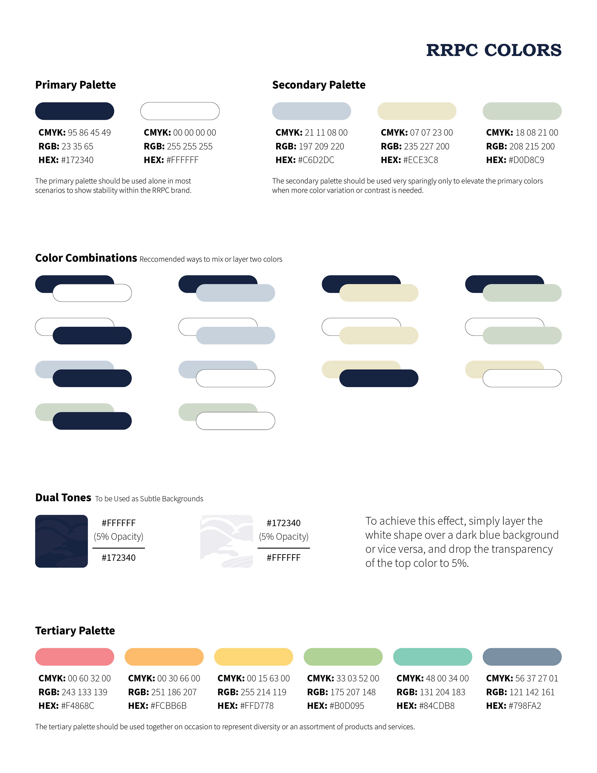

The Colors section includes the current color lineup for the brand, including some I've added, and the color values for each of those colors in RGB, CMYK, and HEX, as well as the use cases for each color. This section also includes appropriate color combinations between the brand colors, and an alternative brand palette for occasional use.
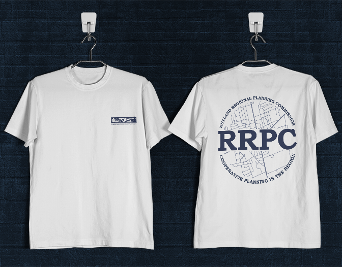
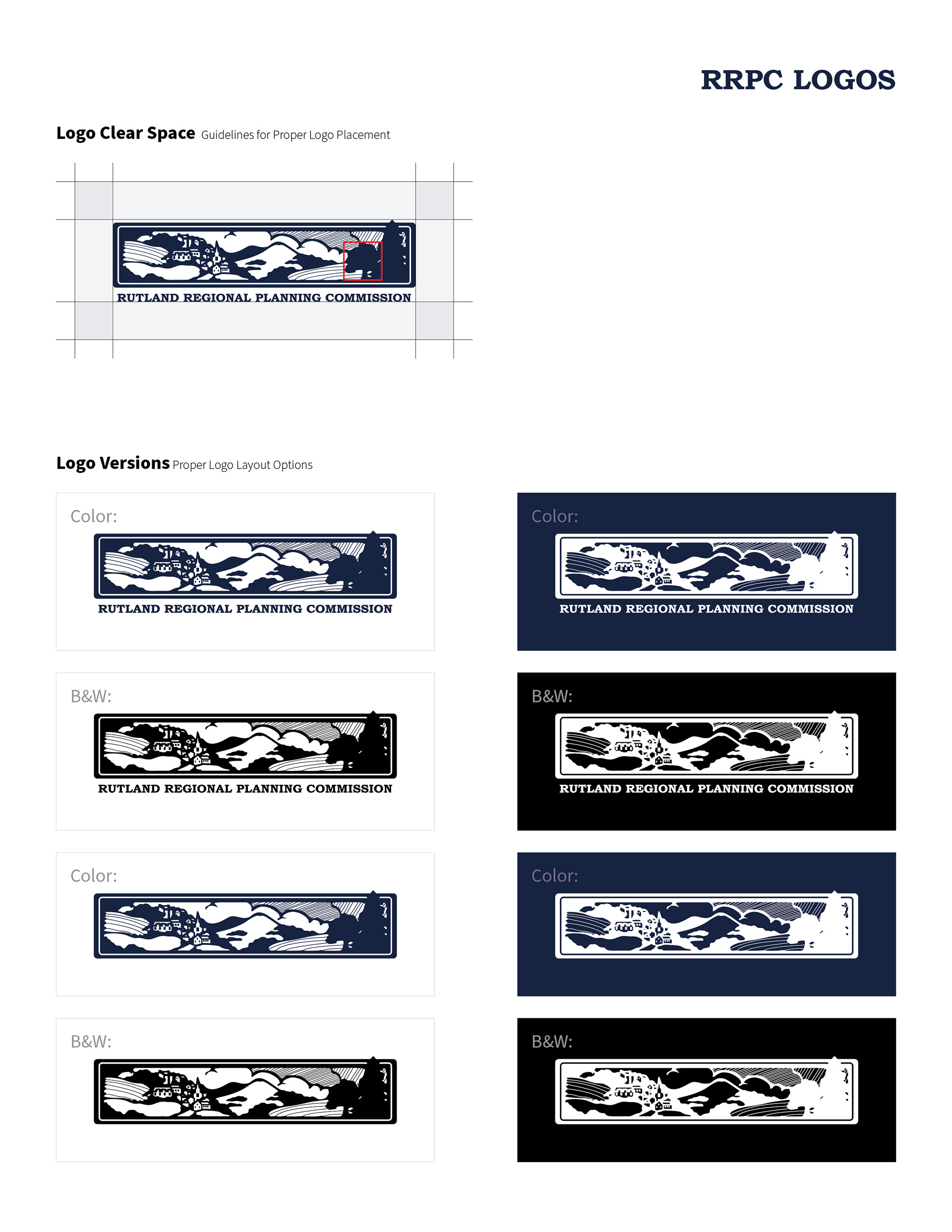
The Logo Section covers all official RRPC logos and variations, as well as the colors such variations may be used in. This section also includes proper logo clear-spacing, or how close it may be placed to other information or borders.
Lastly, the Typography section shows all allowable brand fonts and the use cases for each. It also includes the ideal paragraph layout, proper font sizing, and line spacing.