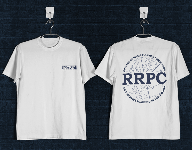
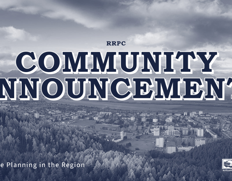
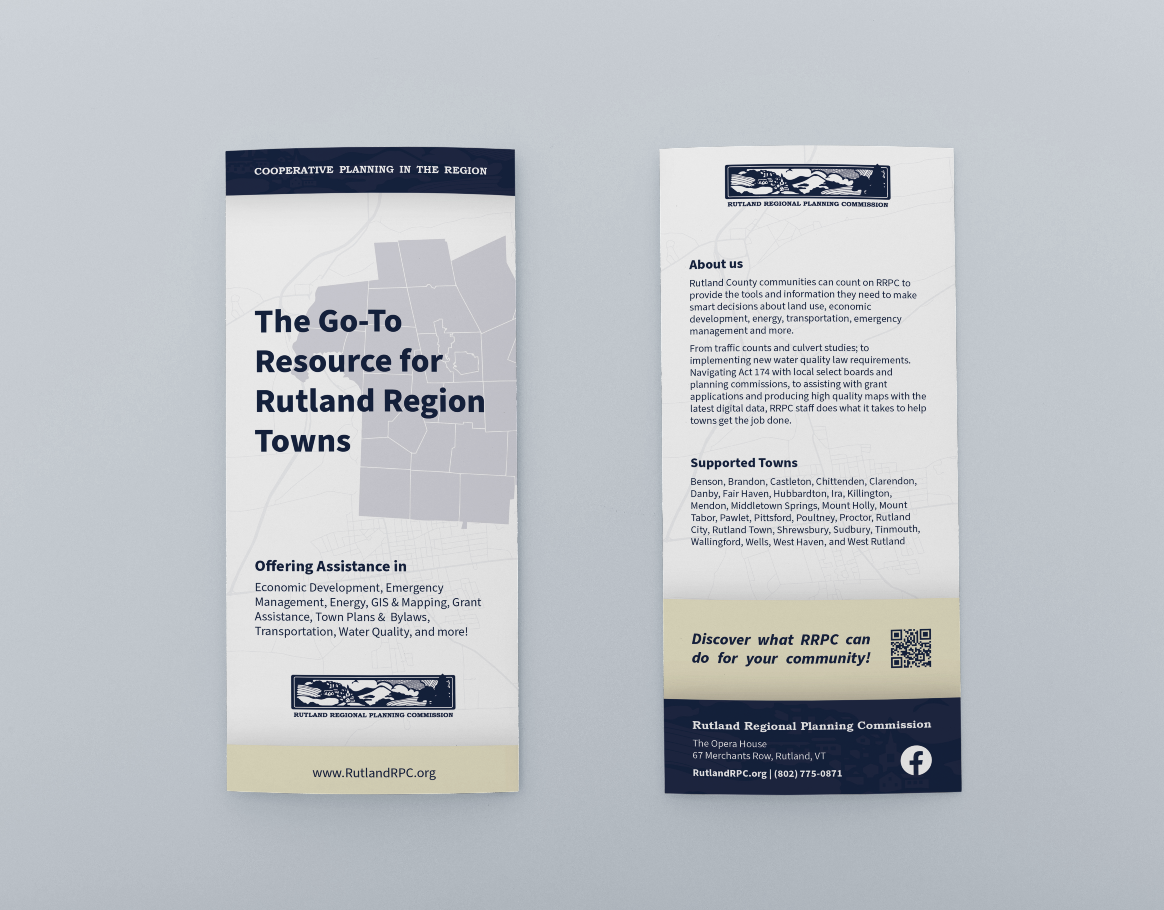
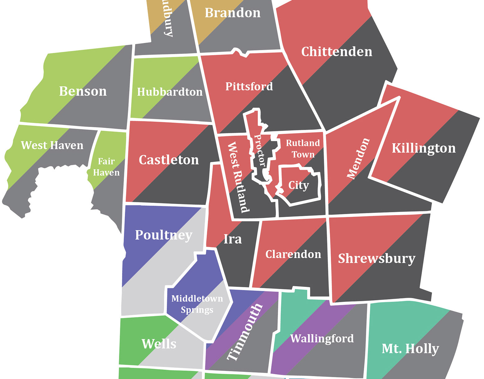
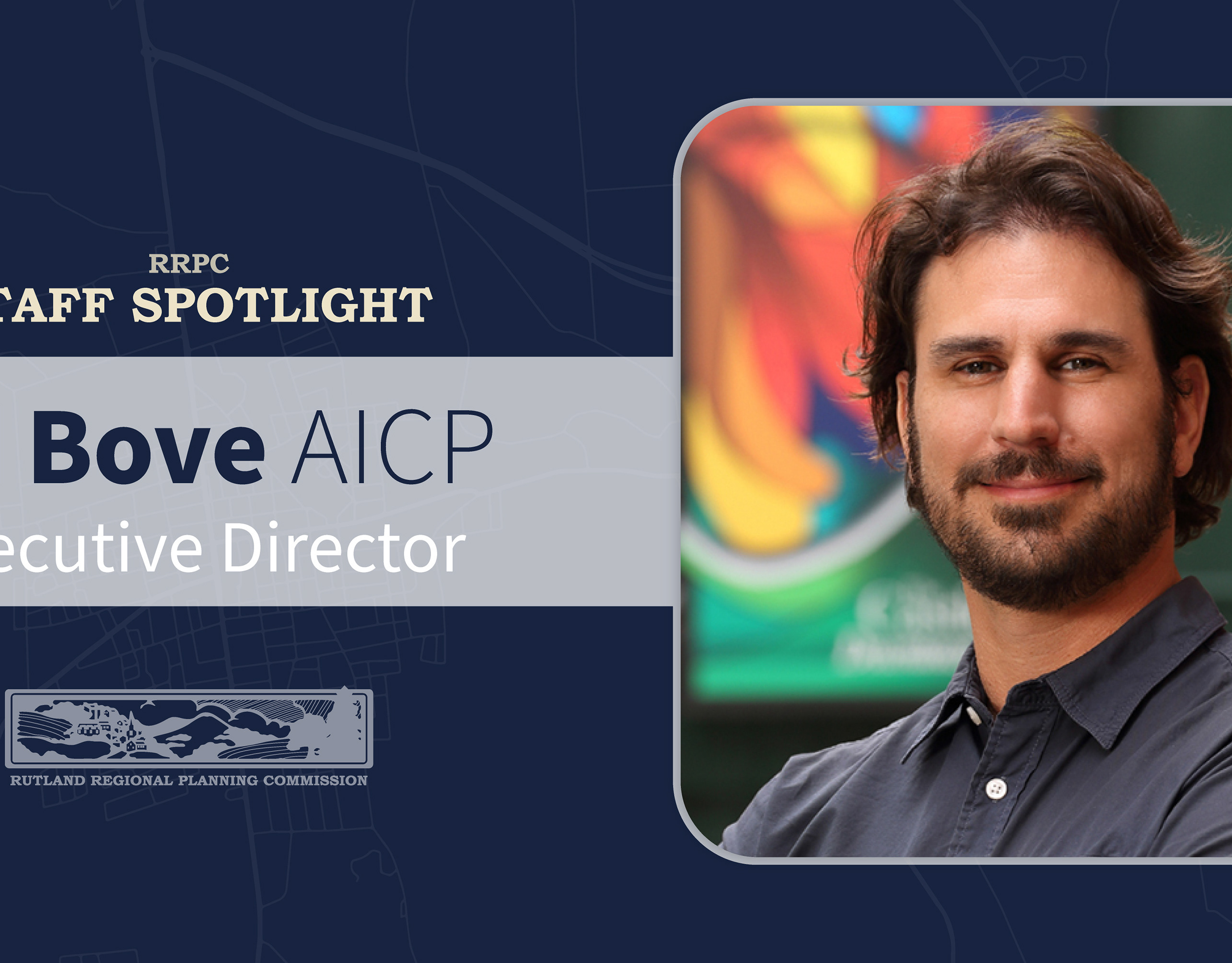
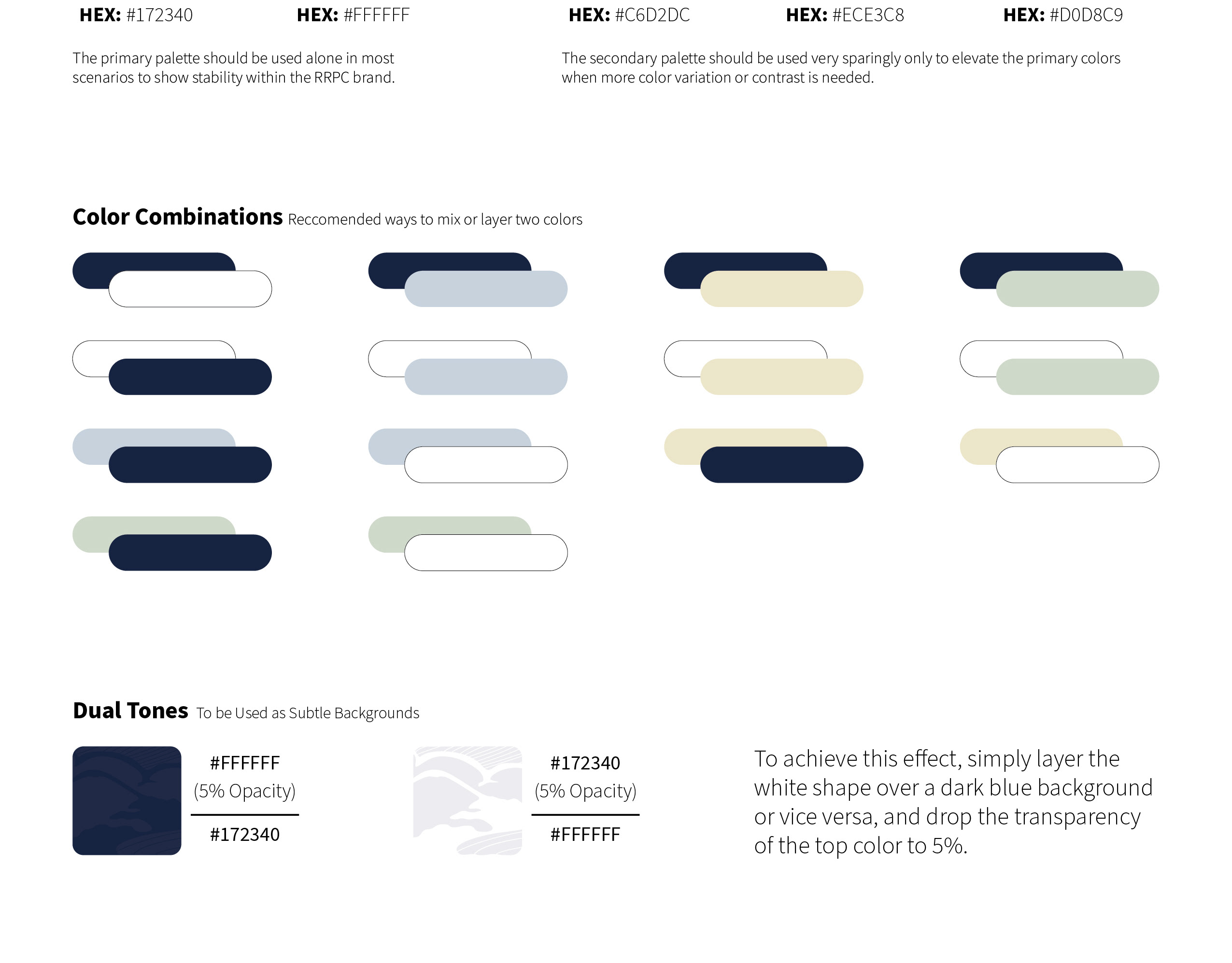
The Rutland Regional Planning Commission (RRPC) is an accomplished regional planning and economic development organization, serving 27 towns in the Rutland Region of Vermont. Here I was a graphic design intern from January 2022 to May 2022, handling all their brand work and graphic needs.
The RRPC logo is a beautiful landscape illustration featuring a small town and rolling hills. Although slightly complex, it's fun, inspiring, and serene. Its awkward dimensions, however, make it difficult to use in many applications, especially social media.
One of my first assignments as the company's graphic design intern was to design an assortment of icons and simple imagery that could be used in place of the RRPC logo on the company's Facebook page. This was an excellent first task because it pushed me to further familiarize myself with the company, how it works, and think about what kind of imagery I can use to represent it accurately. After researching, brainstorming, and sketching, the following are some of the ideas I came up with:




Some concepts combined previous brand elements with new ones such as the first icon featuring classic RRPC lettering with a top-down map of Rutland City. Others take a more simple route, with just RRPC lettering, or a more simplified version of the Logo. Variety was the name of the game here.
With the Facebook profile icons out of the way, it was time to get started on the cover image. Once again, with several options:
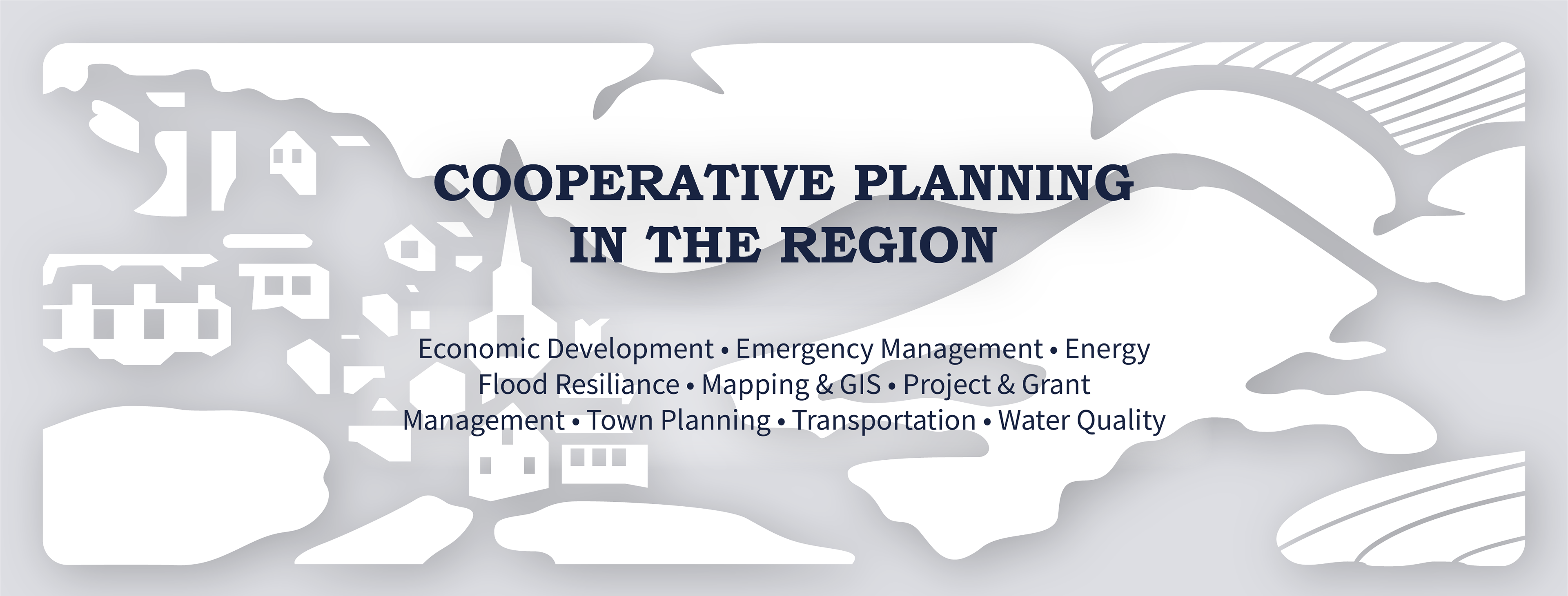
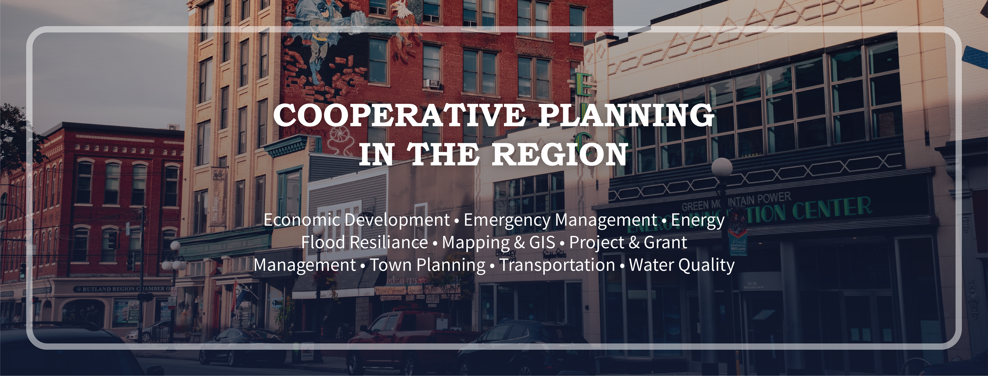
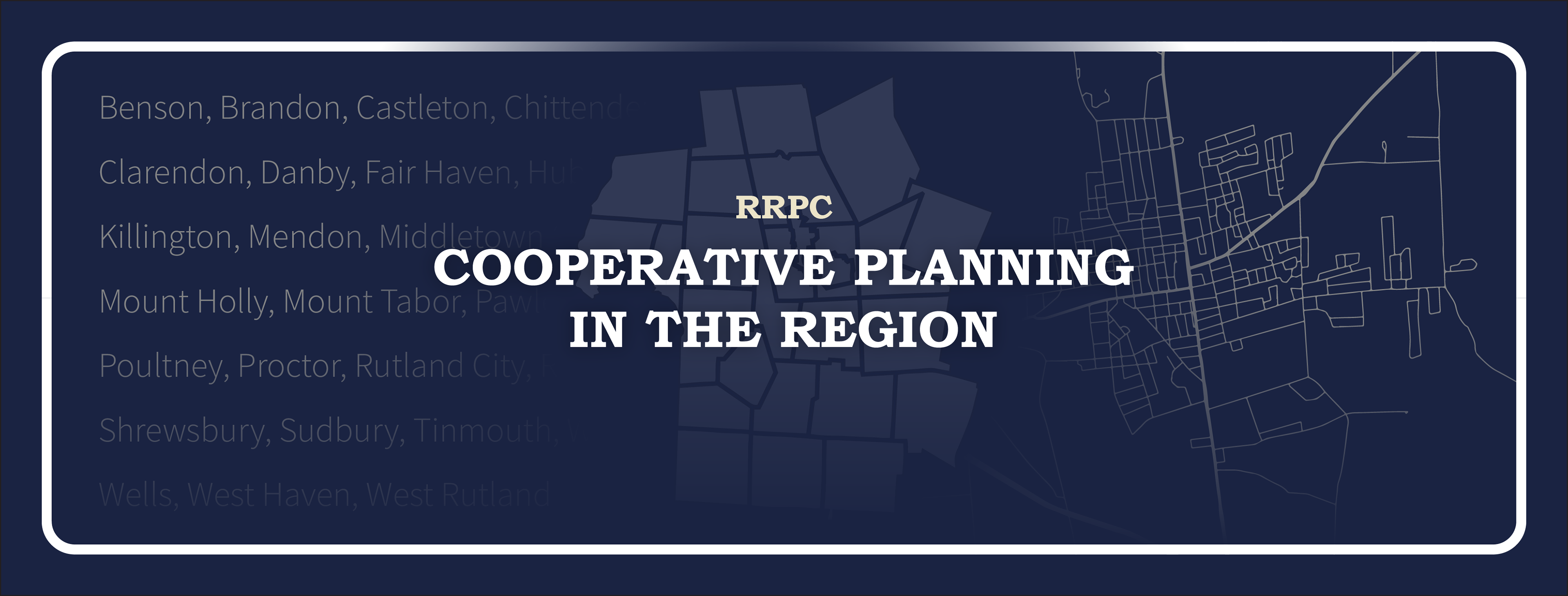
After showing my comps to RRPC's executive director, I got some good feedback and inspiration to carry me towards the finish line. I produced one final Facebook cover photo with influence from my third comp, which the ED really loved, and decided to use publicly:
